Blog
Mobile UX for Ecommerce Stores

Introduction to Mobile UX for ecommerce
Mobile commerce has fundamentally transformed how customers interact with ecommerce brands. Smartphones are no longer secondary browsing devices used only for casual product discovery. Today, mobile devices dominate the ecommerce journey, influencing everything from product research and price comparisons to checkout completion and customer retention. Consumers expect ecommerce websites to provide seamless mobile experiences that feel fast, intuitive, visually appealing, and effortless to use regardless of device size or internet conditions.
As mobile shopping behavior continues growing globally, ecommerce businesses must rethink how online stores are designed and optimized. A desktop-first ecommerce website that merely “fits” onto smaller screens is no longer sufficient. Modern customers demand mobile-first experiences specifically optimized for touch interactions, mobile navigation, speed performance, readability, and frictionless checkout functionality.
Mobile UX, or mobile user experience, refers to how users interact with ecommerce websites on smartphones and tablets. It includes every aspect of the mobile shopping journey, including:
- Mobile navigation
- Product discovery
- Page loading speed
- Search usability
- Mobile responsiveness
- Touch interactions
- Checkout optimization
- Accessibility
- Personalization
- Mobile payment integration
A strong mobile ecommerce UX directly influences conversion rates, bounce rates, customer trust, SEO rankings, and long-term revenue growth. Businesses that prioritize mobile optimization often achieve higher engagement, stronger retention, and improved profitability compared to competitors with weak mobile experiences.
Modern ecommerce customers have become increasingly impatient with slow, cluttered, or confusing mobile websites. Users can switch to competing stores instantly if an ecommerce website creates friction or usability problems. Because of this, mobile UX optimization has become one of the most important strategic priorities for ecommerce businesses in 2026 and beyond.
This comprehensive guide explores everything ecommerce businesses need to know about mobile UX for ecommerce stores, including mobile-first design principles, mobile customer psychology, speed optimization, mobile SEO, checkout usability, navigation strategies, personalization, accessibility, and future mobile commerce trends shaping the ecommerce industry.
Understanding Mobile UX in Ecommerce
Mobile UX in ecommerce focuses on designing online shopping experiences specifically optimized for mobile devices. While desktop ecommerce experiences remain important, smartphones now account for the majority of ecommerce traffic in many industries worldwide.
Mobile ecommerce UX involves much more than responsive web design. Simply resizing desktop layouts for smaller screens does not create an optimized mobile shopping experience. Mobile UX requires strategic planning around how users browse, interact, search, and purchase products using touch-based interfaces and smaller displays.
A high-performing mobile ecommerce UX helps customers:
- Discover products quickly
- Browse categories efficiently
- Read product information comfortably
- Navigate without confusion
- Add products to cart easily
- Complete purchases with minimal friction
Unlike desktop environments, mobile users often shop while multitasking, commuting, watching television, or using public transportation. These browsing conditions make simplicity and usability critically important.
Effective mobile UX design prioritizes:
- Fast page speed
- Thumb-friendly navigation
- Minimal distractions
- Efficient search systems
- Simplified checkout
- Touch-friendly interactions
Businesses that invest in mobile UX optimization create smoother customer journeys that improve engagement and increase ecommerce conversions significantly.
Why Mobile UX Matters More Than Ever
The importance of mobile UX continues increasing because customer behavior has changed dramatically over the past decade. Mobile devices are now central to ecommerce discovery, product research, and online purchasing behavior.
Modern consumers expect mobile ecommerce experiences comparable to the performance and convenience provided by platforms such as:
- Amazon
- TikTok Shop
- YouTube Shopping
- Shopify-powered stores
These platforms have trained customers to expect:
- Instant loading times
- Smooth scrolling
- Personalized recommendations
- Fast checkout experiences
- Seamless mobile interactions
When ecommerce websites fail to meet these expectations, users often leave immediately and continue shopping elsewhere.
Poor mobile UX negatively impacts:
- Conversion rates
- Customer trust
- Brand perception
- SEO rankings
- Customer retention
- Advertising ROI
Strong mobile UX improves:
- Session duration
- Product engagement
- Add-to-cart actions
- Checkout completion
- Repeat purchases
Mobile optimization also influences search engine visibility because Google uses mobile-first indexing to evaluate websites.
Businesses that prioritize mobile UX often outperform competitors in both organic traffic and ecommerce sales performance.
Mobile Commerce Growth and Changing Consumer Behavior
Mobile commerce, often referred to as mCommerce, continues expanding rapidly as smartphones become increasingly integrated into daily life.
Customers now use smartphones for:
- Product research
- Price comparisons
- Reading reviews
- Social shopping
- Influencer-driven purchases
- Order tracking
- Customer support communication
Many users move fluidly between devices during the shopping journey. For example, customers may discover products on Instagram through mobile devices and complete purchases later on desktops or tablets.
Mobile users behave differently from desktop users in several important ways:
- Attention spans are shorter
- Browsing sessions are faster
- Scrolling dominates interactions
- One-handed usage is common
- Speed expectations are higher
Customers frequently browse ecommerce websites while:
- Traveling
- Waiting in queues
- Multitasking
- Using public transportation
Because of these conditions, mobile ecommerce websites must prioritize usability, speed, and simplicity above all else.
The rise of:
- Mobile payment systems
- Digital wallets
- Social commerce
- Voice search
- AI recommendations
has further accelerated mobile commerce growth.
Ecommerce businesses that fail to adapt to evolving mobile shopping behavior risk losing relevance in increasingly competitive digital markets.
Mobile-First Ecommerce Design Principles
Mobile-first design means designing ecommerce experiences specifically for mobile devices before adapting them for larger screens such as desktops or tablets.
Traditional desktop-first approaches often create poor mobile experiences because they prioritize large-screen layouts and then attempt to shrink them for smartphones. Mobile-first design reverses this process and focuses on essential functionality from the beginning.
Mobile-first ecommerce design improves:
- User experience
- Performance optimization
- Conversion rates
- Accessibility
- SEO rankings
One of the most important mobile-first principles is simplicity. Mobile screens provide limited visual space, meaning every design element must serve a clear purpose.
Effective mobile-first ecommerce design prioritizes:
- Minimal clutter
- Clean layouts
- Clear typography
- Strong visual hierarchy
- Efficient navigation
- Fast loading speed
Mobile-first interfaces should focus attention on:
- Products
- Pricing
- CTAs
- Reviews
- Checkout actions
Unnecessary distractions reduce usability and increase friction.
Touch interactions must also remain intuitive. Buttons, menus, and forms should feel natural for thumb-based navigation and one-handed usage.
Businesses seeking professional mobile-first ecommerce website development often invest in conversion-focused design systems that prioritize performance, responsiveness, and usability. Resources like Sri Hayavadhana Solutions provide ecommerce-focused web design and optimization services tailored for modern mobile commerce experiences.
Mobile Navigation Best Practices for Ecommerce Stores
Navigation is one of the most important components of mobile UX because it directly affects how efficiently users can discover products and move through the ecommerce website.
Poor navigation creates frustration and increases bounce rates, especially on smaller screens where usability challenges are amplified.
High-performing mobile ecommerce navigation systems prioritize:
- Clarity
- Simplicity
- Accessibility
- Speed
Hamburger menus remain widely used because they help conserve screen space while organizing categories efficiently. However, navigation systems should still remain intuitive and easy to access without excessive clicks or confusion.
Sticky navigation elements improve usability by keeping important actions visible while users scroll through pages. Common sticky elements include:
- Search bars
- Cart icons
- Menu buttons
- Wishlist access
Search functionality is especially important in mobile ecommerce because many customers prefer searching directly rather than browsing through categories manually.
Strong mobile ecommerce search systems support:
- Predictive search
- Auto-suggestions
- Voice search
- Typo correction
- Smart filtering
Category structures should remain simple and easy to scan. Overly complicated navigation systems overwhelm users and reduce browsing efficiency.
Breadcrumb navigation can further improve usability by helping customers understand their location within the ecommerce store hierarchy.
Businesses that optimize mobile navigation effectively often experience stronger engagement and improved product discovery.
Optimizing Mobile Ecommerce Homepages
The mobile homepage serves as the digital storefront for ecommerce brands. It often creates the first impression users have about the business, making homepage optimization extremely important for engagement and conversions.
Effective mobile ecommerce homepages should immediately communicate:
- Brand identity
- Product focus
- Unique value proposition
- Trustworthiness
Mobile homepages should remain visually appealing without sacrificing performance speed.
Many ecommerce websites overload mobile homepages with:
- Large banners
- Heavy animations
- Excessive popups
- Too many promotions
These elements often slow down performance and create overwhelming experiences for users.
Instead, high-converting mobile homepages focus on:
- Clear messaging
- Featured collections
- Trending products
- Simple navigation
- Fast loading visuals
Visual hierarchy helps guide customer attention naturally toward browsing categories or products.
Trust indicators such as:
- Ratings
- Customer reviews
- Free shipping messages
- Secure payment badges
can further improve engagement and confidence.
Homepage speed optimization remains especially important because mobile users are highly sensitive to loading delays.
Product Page UX for Mobile Ecommerce
Product pages are among the most important conversion-focused areas of ecommerce websites. Mobile product pages must provide essential information clearly while remaining visually clean and easy to interact with.
Product imagery plays a major role because mobile customers cannot physically inspect products before purchasing.
High-performing mobile product pages typically include:
- Swipeable image galleries
- Zoom functionality
- Lifestyle imagery
- Product videos
- Multiple viewing angles
Optimized visuals improve perceived product quality and increase customer confidence.
Product descriptions should remain concise yet informative. Long walls of text reduce readability on smartphones and discourage engagement.
Accordion sections often improve usability by organizing:
- Specifications
- Shipping details
- FAQs
- Reviews
- Return policies
Pricing and CTA buttons should remain highly visible throughout the browsing experience.
Sticky add-to-cart buttons often improve conversions because they keep purchasing actions accessible while users scroll through product details.
Displaying customer reviews prominently helps reduce uncertainty and improve trust.
Strong mobile product page UX directly influences ecommerce conversions and customer satisfaction.
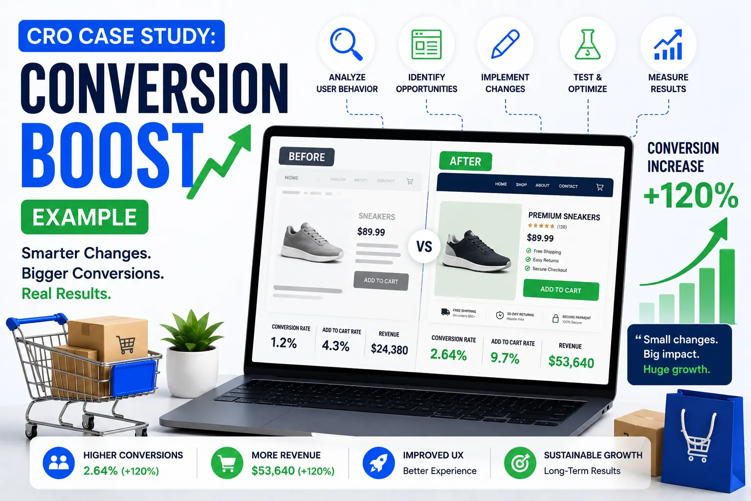
Mobile Checkout Optimization for Higher Conversions
Checkout optimization is one of the most important aspects of mobile ecommerce UX because mobile cart abandonment rates remain significantly higher than desktop abandonment rates.
Complicated checkout systems create friction that discourages users from completing purchases.
High-converting mobile checkout systems prioritize:
- Simplicity
- Speed
- Security
- Convenience
Reducing form complexity is essential because typing on smartphones is less comfortable than desktop typing.
Best practices for mobile checkout optimization include:
- Guest checkout options
- Autofill support
- Address prediction
- Minimal form fields
- Progress indicators
Mobile payment integration significantly improves conversion rates.
Popular mobile payment methods include:
- Apple Pay
- Google Pay
- UPI
- PayPal
- Buy Now Pay Later services
Customers increasingly expect checkout experiences that minimize manual typing and streamline transactions.
Security reassurance is equally important during mobile checkout. Secure payment badges and SSL indicators help customers feel confident about completing purchases.
Transparent pricing is critical because hidden shipping costs or unexpected fees remain major causes of cart abandonment.
Businesses that optimize mobile checkout experiences often see dramatic improvements in ecommerce revenue performance.
Mobile Page Speed and Ecommerce UX
Website speed is one of the most important factors influencing mobile ecommerce UX. Mobile users expect ecommerce websites to load almost instantly regardless of device type or internet connection quality.
Slow-loading ecommerce websites create frustration and significantly increase bounce rates.
Fast mobile experiences improve:
- Customer satisfaction
- Product exploration
- Conversion rates
- SEO rankings
- Customer retention
Common causes of slow mobile ecommerce websites include:
- Large image files
- Excessive JavaScript
- Heavy animations
- Poor hosting environments
- Third-party scripts
Mobile speed optimization strategies include:
- WebP and AVIF image formats
- Lazy loading
- Browser caching
- CDN integration
- Code minification
Google evaluates mobile website performance using Core Web Vitals metrics, meaning speed optimization directly affects SEO visibility.
Helpful resources:
Businesses that continuously optimize mobile performance typically achieve stronger ecommerce growth and better user engagement.
Mobile Typography and Readability
Typography significantly affects mobile ecommerce usability because smaller screens make readability more challenging.
Poor typography can create:
- Eye strain
- Confusion
- Higher bounce rates
- Lower engagement
Effective mobile typography prioritizes:
- Readable font sizes
- Proper spacing
- Clear hierarchy
- Strong contrast
Mobile users often skim content quickly rather than reading long paragraphs in detail. Breaking content into shorter sections improves readability and comprehension.
Important information such as:
- Product pricing
- Delivery timelines
- Discounts
- CTAs
should remain visually prominent.
Typography also contributes to overall brand perception. Clean, professional typography creates more trustworthy ecommerce experiences.
Readable mobile interfaces improve customer confidence and support stronger conversion performance.
Touch-Friendly Mobile UX Design
Touch interactions require different design considerations compared to desktop mouse interactions.
Mobile ecommerce websites should optimize for:
- Finger tapping
- Swiping
- Scrolling
- One-handed navigation
Buttons and interactive elements should remain large enough for comfortable touch interactions. Tiny tap targets often create frustration and accidental clicks.
Touch-friendly ecommerce UX includes:
- Large buttons
- Swipeable product galleries
- Sticky CTAs
- Adequate spacing
- Gesture support
Thumb-friendly positioning is especially important because many users interact with smartphones using one hand.
Critical actions such as:
- Add to Cart
- Checkout
- Search
should remain easily accessible within natural thumb zones.
Touch-friendly optimization improves usability and customer satisfaction significantly.
Mobile UX and Ecommerce SEO
Mobile UX directly impacts ecommerce SEO because Google prioritizes mobile-first indexing.
Search engines favor ecommerce websites that provide:
- Fast loading speeds
- Mobile responsiveness
- Strong usability
- Accessible interfaces
Poor mobile UX negatively affects:
- Bounce rates
- Session duration
- Engagement metrics
These behavioral signals can indirectly impact search rankings.
SEO-friendly mobile ecommerce websites typically include:
- Responsive layouts
- Structured content
- Optimized imagery
- Fast performance
- Mobile-friendly navigation
Businesses investing in mobile UX optimization often achieve stronger organic visibility and higher-quality search traffic.
Helpful SEO resources:
Mobile SEO and UX should work together as part of a unified ecommerce optimization strategy.
Personalization in Mobile Ecommerce UX
Personalization helps create more relevant and engaging mobile shopping experiences.
Modern ecommerce platforms personalize:
- Product recommendations
- Homepage content
- Promotions
- Search results
Personalized mobile UX improves:
- Product discovery
- Customer engagement
- Average order value
- Customer retention
AI-powered recommendation systems help customers discover products quickly without excessive browsing.
Wishlist systems also improve usability by allowing users to save products for future consideration.
Behavior-based notifications and abandoned cart reminders further strengthen retention strategies.
As AI technology continues evolving, personalization will become even more important for mobile ecommerce experiences.
Accessibility in Mobile Ecommerce UX
Accessibility ensures ecommerce websites remain usable for customers with disabilities or limitations.
Accessible mobile ecommerce UX improves usability for all users, not only those with disabilities.
Important accessibility considerations include:
- Screen reader compatibility
- Keyboard navigation
- Alt text for images
- Sufficient contrast
- Readable typography
Accessible ecommerce websites often achieve:
- Better SEO
- Broader customer reach
- Improved usability
- Stronger compliance
Accessibility should remain integrated into ecommerce UX strategy from the beginning rather than treated as a secondary consideration.
Helpful accessibility resource:
Common Mobile UX Mistakes in Ecommerce Stores
Many ecommerce businesses unintentionally create poor mobile experiences because of avoidable design and performance mistakes.
Slow-loading pages remain one of the biggest mobile UX problems. Heavy scripts, oversized images, and poor optimization create frustrating browsing experiences.
Cluttered mobile layouts also hurt usability by overwhelming users with:
- Too many banners
- Excessive popups
- Competing CTAs
- Visual distractions
Weak search functionality reduces product discovery efficiency, especially for large ecommerce catalogs.
Complicated checkout systems remain another major issue. Long forms, mandatory account creation, and hidden fees increase abandonment significantly.
Poor touch optimization creates additional frustration through:
- Tiny buttons
- Inadequate spacing
- Difficult interactions
Businesses that regularly audit and optimize mobile UX often achieve stronger conversion performance and improved customer satisfaction.
Future Trends in Mobile Ecommerce UX
Mobile ecommerce UX continues evolving rapidly as technology and consumer behavior change.
Voice commerce is expected to grow as voice assistants become increasingly integrated into ecommerce ecosystems. Voice search optimization will likely become more important for product discovery.
Augmented reality and 3D product visualization technologies are also expanding because they help customers understand products better before purchasing.
AI-powered personalization will continue improving mobile shopping experiences through predictive recommendations and adaptive interfaces.
Progressive Web Apps (PWAs) are becoming increasingly popular because they combine app-like performance with browser accessibility.
Gesture-based navigation and immersive shopping experiences may become more common as smartphone technology evolves further.
Businesses that adapt to emerging mobile UX trends early will remain more competitive in the future ecommerce landscape.
Final Thoughts
Mobile UX has become one of the most important factors influencing ecommerce success in 2026 and beyond. As mobile commerce continues dominating online shopping behavior, ecommerce businesses must prioritize seamless, fast, intuitive, and conversion-focused mobile experiences across every stage of the customer journey.
Strong mobile ecommerce UX improves:
- Customer satisfaction
- Conversion rates
- SEO visibility
- Customer retention
- Brand trust
- Revenue growth
Successful mobile ecommerce experiences combine:
- Mobile-first design
- Fast loading performance
- Simplified navigation
- Touch-friendly interactions
- Optimized checkout systems
- Personalized shopping experiences
Modern customers expect ecommerce websites to function flawlessly on smartphones regardless of screen size or internet conditions. Businesses that fail to meet these expectations risk losing customers to competitors with stronger mobile experiences.
Whether developing Shopify stores, WooCommerce websites, Magento platforms, or custom ecommerce applications, mobile UX optimization should remain a continuous strategic priority.
The future of ecommerce will increasingly revolve around experience quality, mobile convenience, personalization, and frictionless interactions. Businesses that consistently improve mobile usability and customer satisfaction will remain competitive and profitable in the evolving digital commerce industry.