Blog
Color Psychology in Ecommerce Design
Introduction to Color Psychology in Ecommerce Design
Color plays a powerful role in ecommerce design because it directly influences how customers perceive brands, products, pricing, trustworthiness, and overall shopping experiences. Long before users begin reading product descriptions or comparing prices, they subconsciously react to visual elements such as colors, layouts, typography, imagery, and contrast. Among these elements, color remains one of the most emotionally influential design components in digital commerce.
In ecommerce, color is not simply a decorative choice. It affects user behavior, customer emotions, conversion rates, purchasing decisions, brand recognition, and browsing patterns. Successful ecommerce brands carefully use color psychology to create emotional connections with customers, guide attention strategically, strengthen branding, improve usability, and encourage conversions.
Modern ecommerce customers interact with hundreds of websites, advertisements, social media promotions, and digital storefronts every day. In such highly competitive environments, visual differentiation becomes essential. Color helps ecommerce businesses establish unique brand identities while shaping how customers emotionally experience online stores.
Different colors create different emotional responses. Some colors communicate trust and professionalism, while others create urgency, excitement, luxury, calmness, or energy. Understanding how colors influence customer psychology allows ecommerce businesses to make more strategic design decisions that improve both user experience and sales performance.
Color psychology affects many aspects of ecommerce design, including:
- Brand identity
- Homepage design
- Product presentation
- CTA buttons
- Navigation systems
- Trust signals
- Mobile usability
- Conversion optimization
- Customer engagement
This comprehensive guide explores color psychology in ecommerce design in depth, including how colors influence emotions, branding strategies, conversion optimization, product perception, mobile UX, accessibility, cultural considerations, and future ecommerce color trends shaping modern online shopping experiences.
Understanding Color Psychology in Ecommerce
Color psychology refers to how colors influence human emotions, perceptions, and behaviors. In ecommerce, color psychology helps businesses create visual environments that encourage trust, engagement, and purchasing behavior.
Customers react emotionally to colors almost instantly. These reactions are often subconscious, meaning users may not actively realize how color influences their decisions. However, color significantly shapes:
- Brand perception
- Product quality perception
- Emotional connection
- Trust levels
- Attention focus
- Shopping confidence
For example:
- Blue often communicates trust and reliability
- Red creates urgency and excitement
- Green represents growth and health
- Black conveys luxury and sophistication
- Orange encourages energy and action
The effectiveness of color psychology depends on:
- Brand positioning
- Industry type
- Target audience
- Cultural context
- Product categories
Successful ecommerce design uses colors strategically rather than randomly.
Modern ecommerce businesses invest heavily in visual branding because color consistency improves recognition and customer trust. Customers often associate specific colors directly with brands, creating long-term emotional familiarity.
Color psychology should work alongside:
- Typography
- Imagery
- Layout structure
- Navigation design
- UX strategy
to create cohesive ecommerce experiences.
Why Color Matters in Ecommerce Design
Color directly influences customer behavior in ecommerce environments because online shopping relies heavily on visual perception.
Unlike physical retail stores where customers can touch products and interact with environments physically, ecommerce experiences depend almost entirely on visual communication.
Color affects:
- First impressions
- Emotional reactions
- Product attention
- CTA visibility
- Navigation clarity
- Conversion rates
Customers often judge ecommerce websites within seconds. A poorly designed color palette can make websites feel:
- Unprofessional
- Outdated
- Untrustworthy
- Overwhelming
On the other hand, strategic color systems help ecommerce websites feel:
- Modern
- Premium
- Trustworthy
- Easy to use
Color also improves visual hierarchy by guiding customer attention toward important areas such as:
- CTA buttons
- Promotional banners
- Product highlights
- Navigation menus
Businesses that strategically optimize color psychology often improve:
- User engagement
- Brand recognition
- Customer retention
- Conversion rates
Color decisions should always align with broader ecommerce UX and branding goals.
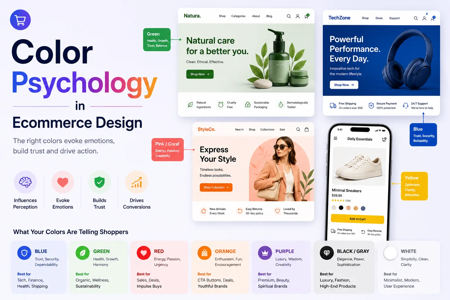
How Colors Influence Customer Emotions
Different colors trigger different emotional and psychological reactions.
Understanding emotional associations helps ecommerce businesses create more effective visual experiences.
Blue and Trust
Blue is one of the most commonly used colors in ecommerce because it communicates:
- Trust
- Security
- Stability
- Professionalism
Many technology, finance, and ecommerce brands use blue because customers associate it with reliability and safety.
Blue works especially well for:
- Payment systems
- Checkout pages
- Corporate ecommerce brands
- Electronics stores
Lighter blues often feel calming and approachable, while darker blues communicate authority and sophistication.
Red and Urgency
Red is a highly energetic color associated with:
- Excitement
- Urgency
- Passion
- Attention
Ecommerce websites often use red strategically for:
- Sale banners
- Discount offers
- Limited-time promotions
- CTA buttons
Red attracts attention quickly, making it effective for conversion-focused elements.
However, excessive red usage can feel overwhelming or aggressive.
Successful ecommerce design uses red selectively rather than excessively.
Green and Growth
Green commonly represents:
- Health
- Nature
- Freshness
- Sustainability
- Wealth
Green works particularly well for:
- Organic products
- Health brands
- Eco-friendly ecommerce stores
- Financial products
Green also creates calming effects and often improves visual comfort.
Many ecommerce businesses use green for:
- Positive notifications
- Checkout confirmations
- Sustainability messaging
because customers associate green with positivity and reassurance.
Black and Luxury
Black communicates:
- Sophistication
- Exclusivity
- Luxury
- Premium quality
Luxury ecommerce brands often use black-heavy color schemes to create elegant and high-end shopping experiences.
Black works especially well for:
- Fashion brands
- Luxury accessories
- Premium electronics
- Designer products
However, black-heavy designs require careful contrast management to maintain readability and usability.
White and Simplicity
White represents:
- Cleanliness
- Simplicity
- Minimalism
- Clarity
Modern ecommerce websites frequently use white space strategically because it improves:
- Readability
- Visual hierarchy
- Product focus
- UX clarity
Minimalist ecommerce designs often rely heavily on white backgrounds to create clean and premium visual experiences.
White space helps reduce clutter and improves customer focus on products.
Orange and Action
Orange combines the energy of red with the friendliness of yellow.
Orange often communicates:
- Enthusiasm
- Creativity
- Friendliness
- Action
Ecommerce websites commonly use orange for:
- CTA buttons
- Promotional highlights
- Limited-time offers
Orange creates strong visual contrast and encourages interaction.
Many ecommerce brands use orange strategically to improve CTA visibility and engagement.
Color Psychology and Ecommerce Branding
Color is one of the most recognizable aspects of brand identity.
Strong ecommerce brands maintain consistent color systems across:
- Websites
- Logos
- Packaging
- Advertisements
- Social media content
Color consistency improves:
- Brand recognition
- Customer familiarity
- Emotional connection
- Professionalism
Customers often associate specific colors directly with brands.
For example:
- Red with Coca-Cola
- Blue with Facebook
- Yellow with McDonald’s
Successful ecommerce branding uses color strategically to reinforce brand personality.
Brand color choices should align with:
- Target audience
- Industry positioning
- Product categories
- Emotional messaging
Businesses building strong ecommerce branding systems often work with professional UX and branding specialists such as Sri Hayavadhana Solutions to create cohesive ecommerce experiences optimized for conversion, usability, and brand identity.
Using Color to Improve Ecommerce Conversion Rates
Color significantly affects ecommerce conversion optimization because it guides attention and influences purchasing behavior.
Strategic color usage can improve:
- CTA visibility
- Product emphasis
- Promotion effectiveness
- Checkout usability
CTA buttons should stand out clearly from surrounding content.
Strong CTA colors often include:
- Orange
- Green
- Red
- Blue
depending on overall brand design.
Contrast is more important than choosing a universally “best” color.
For example:
- A green CTA may perform better on dark websites
- Orange may work better on minimalist white layouts
A/B testing color variations helps ecommerce businesses identify what works best for specific audiences.
Color psychology should support:
- Clarity
- Accessibility
- Visual hierarchy
rather than relying purely on emotional assumptions.
Conversion-focused color systems improve usability while encouraging customer action naturally.
Product Presentation and Color Psychology
Product presentation strongly affects perceived product value in ecommerce environments.
Color influences:
- Product desirability
- Perceived quality
- Emotional appeal
Product photography backgrounds also affect perception.
For example:
- White backgrounds improve clarity and professionalism
- Dark backgrounds create premium aesthetics
- Lifestyle imagery adds emotional context
Color harmony between products and website design improves visual consistency.
Fashion ecommerce stores often use:
- Neutral backgrounds
- Soft tones
- Minimalist layouts
to keep focus on products.
Bright and vibrant ecommerce brands may use bold color schemes to create energetic shopping experiences.
Color psychology should support product positioning and target audience expectations.
Color Psychology in Mobile Ecommerce Design
Mobile ecommerce UX requires specialized color optimization because smartphone screens create different viewing experiences compared to desktop monitors.
Mobile color systems should prioritize:
- Readability
- Contrast
- Touch visibility
- Simplicity
Mobile users browse quickly, making visual clarity especially important.
CTA buttons should remain highly visible on smaller screens.
Dark mode compatibility is also becoming increasingly important in mobile ecommerce UX.
Poor mobile color choices can reduce:
- Readability
- Engagement
- Navigation usability
Optimized mobile color systems improve:
- Customer experience
- Product visibility
- Conversion rates
Mobile-first ecommerce design should carefully test color contrast across devices and lighting conditions.
Visual Hierarchy and Color Strategy
Color helps create visual hierarchy by guiding user attention strategically.
Effective ecommerce visual hierarchy helps customers focus on:
- Important products
- Promotions
- CTA buttons
- Navigation elements
Color contrast can highlight important actions without overwhelming users.
For example:
- Bright CTA colors attract attention quickly
- Neutral backgrounds improve readability
- Consistent accent colors strengthen navigation clarity
Too many competing colors create visual confusion and reduce usability.
Successful ecommerce designs use color strategically rather than excessively.
Visual hierarchy should support smooth customer journeys throughout the ecommerce experience.
Accessibility and Color Contrast
Accessibility is essential in ecommerce color design because poor contrast and color choices can reduce usability for users with visual impairments.
Accessible ecommerce color systems prioritize:
- Strong contrast ratios
- Readability
- Clear interactive states
Important accessibility considerations include:
- Text visibility
- CTA clarity
- Link distinction
- Error notification visibility
Color should never be the only method used to communicate information because colorblind users may not distinguish certain combinations effectively.
Accessible ecommerce design improves:
- Customer inclusivity
- SEO performance
- User experience
Helpful accessibility resource:
Accessibility should remain integrated into ecommerce color strategy from the beginning.
Cultural Differences in Color Psychology
Color meanings vary across cultures, making localization important for global ecommerce brands.
For example:
- White symbolizes purity in some cultures
- White may symbolize mourning in others
Similarly:
- Red represents luck in some Asian cultures
- Red may represent danger or urgency elsewhere
Global ecommerce businesses should consider:
- Regional color associations
- Cultural preferences
- Localization strategies
Understanding cultural color psychology improves international customer engagement and brand acceptance.
Localized ecommerce experiences often perform better in global markets.
Minimalist Color Systems in Ecommerce
Minimalist ecommerce design has become increasingly popular because customers prefer clean and distraction-free shopping experiences.
Minimalist color systems often use:
- Neutral tones
- White space
- Limited accent colors
Benefits include:
- Improved readability
- Better product focus
- Faster visual processing
- Cleaner UX
Minimalist ecommerce layouts often feel:
- Premium
- Modern
- Professional
However, minimalist designs still require strong contrast and strategic color emphasis to maintain engagement and usability.
Dark Mode and Ecommerce Design
Dark mode is becoming increasingly popular across mobile apps, operating systems, and ecommerce platforms.
Dark mode interfaces reduce eye strain in low-light environments and create premium visual aesthetics.
Benefits of dark mode include:
- Modern appearance
- Better battery efficiency on OLED screens
- Improved nighttime usability
Dark ecommerce designs often use:
- Black backgrounds
- Soft contrast tones
- Bright CTA accents
However, dark mode requires careful readability optimization.
Poor dark mode implementation can reduce:
- Accessibility
- Product visibility
- UX clarity
Businesses increasingly design ecommerce systems with both light and dark mode compatibility.
Common Color Psychology Mistakes in Ecommerce
Many ecommerce businesses unintentionally create poor UX through ineffective color strategies.
Common mistakes include:
- Excessive color usage
- Weak contrast
- Inconsistent branding
- Hard-to-read text
- Overwhelming backgrounds
Poor CTA visibility also reduces conversion performance significantly.
Color systems should support usability rather than purely aesthetic preferences.
Another major issue is ignoring mobile optimization.
Colors appearing attractive on desktops may become difficult to read on smartphones.
Businesses should continuously test:
- Contrast ratios
- Mobile readability
- CTA visibility
- Accessibility compliance
Strong ecommerce color systems require ongoing optimization and testing.
Future Trends in Ecommerce Color Design
Ecommerce color design continues evolving alongside customer expectations and technology trends.
Future ecommerce color trends may include:
- AI-personalized interfaces
- Dynamic theme adaptation
- Advanced dark mode systems
- Immersive shopping experiences
- Interactive color customization
AI-powered UX systems may eventually personalize color schemes dynamically based on user behavior and preferences.
Minimalist and accessibility-focused design trends will likely continue growing because customers increasingly prioritize usability and clarity.
Sustainability-focused ecommerce brands may also continue emphasizing earthy and natural color palettes.
Businesses adapting early to evolving design trends will remain more competitive in future ecommerce markets.
Final Thoughts
Color psychology plays a major role in ecommerce success because it influences customer emotions, usability, trust perception, brand identity, and purchasing behavior.
Successful ecommerce color systems combine:
- Emotional strategy
- Branding consistency
- Accessibility
- Mobile optimization
- Conversion-focused UX
Modern customers expect ecommerce websites to feel visually appealing, trustworthy, intuitive, and easy to navigate.
Businesses investing in strategic color psychology often achieve:
- Higher conversion rates
- Better brand recognition
- Improved customer retention
- Stronger engagement
- Enhanced customer trust
Whether building Shopify stores, WooCommerce websites, Magento platforms, or custom ecommerce applications, color strategy should remain a central component of ecommerce UX and branding decisions.
The future of ecommerce design will increasingly revolve around personalized experiences, accessibility-focused interfaces, immersive mobile UX, and emotionally engaging visual systems. Businesses that consistently optimize color psychology and user experience will remain competitive and profitable in the evolving ecommerce industry.