Blog
Checkout Optimization Guide to Reduce Cart Abandonment (Complete 2026 Guide)
Introduction: The Hidden Revenue Leak in Ecommerce
Every ecommerce business focuses heavily on traffic—SEO, ads, social media—but most overlook the most critical stage: checkout.
The checkout page is where revenue is either captured or lost.
Industry studies consistently show that average cart abandonment rates range from 60% to 80%, meaning most users who add products to their cart never complete the purchase. That’s not just a UX issue—it’s a direct revenue loss.
For example, global ecommerce leaders like Amazon invest heavily in checkout optimization, refining every step to minimize friction. The result is a near-frictionless buying experience that converts at scale.
This guide will walk you through:
- Why users abandon carts
- How to optimize each checkout step
- Psychological triggers that drive completion
- Technical and UX improvements
- Advanced strategies used by high-performing ecommerce brands
What Is Checkout Optimization?
Checkout optimization is the process of improving the final stage of the buyer journey—where users enter their details, choose payment methods, and confirm their purchase.
It focuses on reducing friction, building trust, and making the process as smooth as possible.
Why Checkout Optimization Matters
Even a small improvement can lead to massive gains.
Example:
- 10,000 visitors → 1,000 add to cart
- 70% abandon → only 300 purchases
If you reduce abandonment to 50%:
- 500 purchases instead of 300
- That’s a 66% increase in revenue without extra traffic
Platforms like Shopify emphasize checkout optimization as one of the highest ROI improvements for online stores.
Understanding Cart Abandonment: Why Users Leave
Before fixing the problem, you must understand why it happens.
1. Unexpected Costs
The most common reason users abandon carts is hidden charges.
Examples:
- Shipping fees
- Taxes
- Handling charges
When users see a higher price than expected, trust drops instantly.
2. Forced Account Creation
Many users don’t want to create an account.
They prefer:
- Fast checkout
- Minimal steps
Forcing registration creates friction.
3. Complicated Checkout Process
Too many steps = higher drop-offs.
Common issues:
- Long forms
- Multiple pages
- Confusing layout
4. Limited Payment Options
If users don’t find their preferred payment method, they leave.
Especially in India:
- UPI is critical
- Wallets are popular
- COD still matters
Payment solutions like Razorpay help solve this.
5. Lack of Trust
Users hesitate if they don’t feel secure.
Missing trust signals:
- SSL certificate
- Payment security badges
- Clear return policy
6. Slow Website Speed
Speed directly impacts conversions.
Use tools like
👉 Google PageSpeed Insights
Even a 2–3 second delay can cause abandonment.
The Ideal Checkout Flow (High-Converting Structure)
A high-converting checkout follows a simple structure:
- Cart Review
- Shipping Details
- Payment
- Order Confirmation
The key is to reduce friction at each step.
Single-Page vs Multi-Step Checkout
Single-Page Checkout
All fields in one page.
Pros:
- Faster completion
- No page reloads
Cons:
- Can feel overwhelming
Multi-Step Checkout
Divided into steps.
Pros:
- Easier to process
- Cleaner UI
Cons:
- More clicks
Which Is Better?
It depends on your audience.
High-performing platforms like BigCommerce often use optimized multi-step checkout with progress indicators.
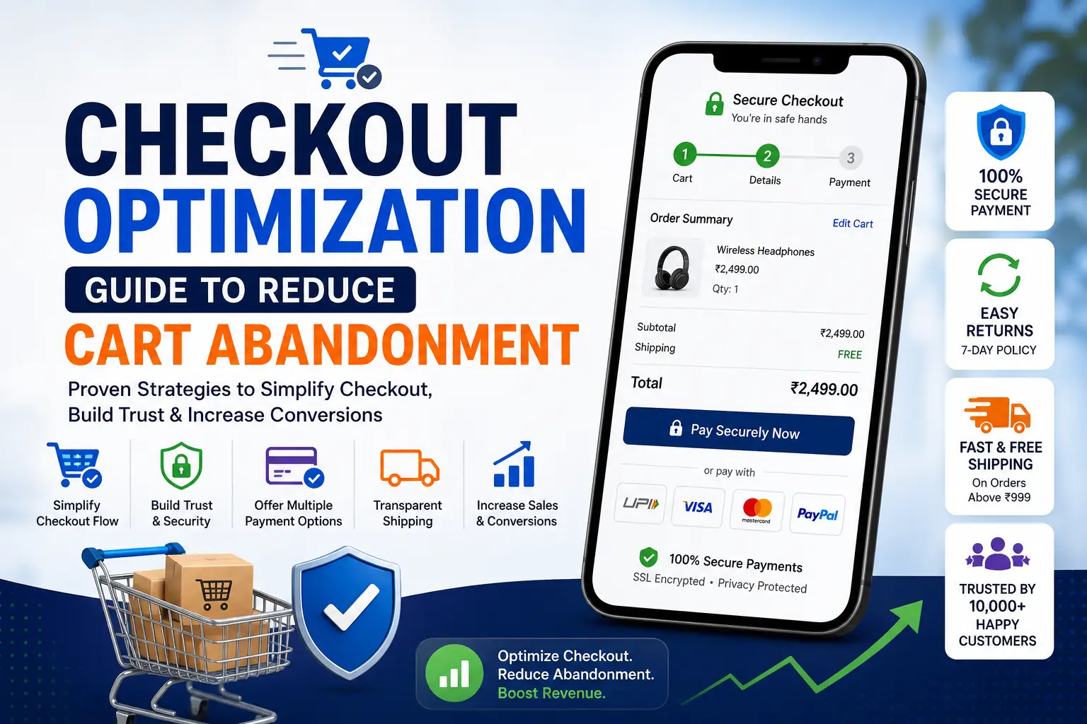
Step-by-Step Checkout Optimization
Step 1: Cart Page Optimization
This is where users review their decision.
Best Practices
Show Clear Product Details
- Product name
- Image
- Quantity
- Price
Allow Easy Edits
Users should be able to:
- Remove items
- Change quantity
Display Total Cost Early
Avoid surprises later.
Step 2: Guest Checkout (Mandatory)
Never force login.
Why It Works
- Reduces friction
- Speeds up checkout
- Improves conversions
You can always ask users to create an account after purchase.
Step 3: Form Optimization (Critical)
Forms are one of the biggest friction points.
Reduce Fields
Only ask for:
- Name
- Address
- Phone
Avoid unnecessary inputs.
Use Autofill
Browsers and tools like
👉 Google Chrome
support autofill to speed up entry.
Inline Validation
Show errors instantly instead of after submission.
Step 4: Payment Optimization
This is the most sensitive stage.
Offer Multiple Options
- UPI
- Credit/Debit cards
- Net banking
- Wallets
- Cash on Delivery
Secure Payment Experience
Show:
- SSL lock
- Secure badges
- Payment logos
Reduce Payment Friction
Avoid:
- Redirecting users unnecessarily
- Complex verification steps
Step 5: Trust Signals That Increase Conversions
Trust is everything in checkout.
Add:
- “100% Secure Payment”
- Money-back guarantee
- Easy return policy
Platforms like PayPal build trust globally.
Step 6: Shipping Optimization
Shipping plays a huge role in conversion.
Show Delivery Time Clearly
Example:
“Delivery in 2–4 days”
Offer Free Shipping Threshold
Example:
“Free shipping above ₹999”
This increases average order value.
Step 7: Progress Indicators
Users should know where they are.
Example:
- Step 1: Cart
- Step 2: Address
- Step 3: Payment
This reduces anxiety.
Step 8: Error Handling & UX
Bad error messages kill conversions.
Good UX Practices
- Clear error messages
- Highlight incorrect fields
- Preserve entered data
Step 9: Mobile Checkout Optimization
Mobile users dominate ecommerce traffic.
Optimize For:
- Thumb-friendly buttons
- Fast loading
- Minimal typing
Platforms like Flipkart excel in mobile checkout UX.
Psychological Triggers That Reduce Abandonment
1. Urgency
Example:
“Only 3 items left”
2. Scarcity
Example:
“Limited stock”
3. Social Proof
Show:
- Ratings
- Reviews
- Purchases
4. Risk Reversal
Example:
“Easy 7-day returns”
Email & Retargeting Recovery Strategy
Even optimized checkouts won’t convert everyone.
Use Abandoned Cart Emails
Send:
- 1 hour later
- 24 hours later
- 3 days later
Retargeting Ads
Use platforms like
👉 Meta Ads
to bring users back.
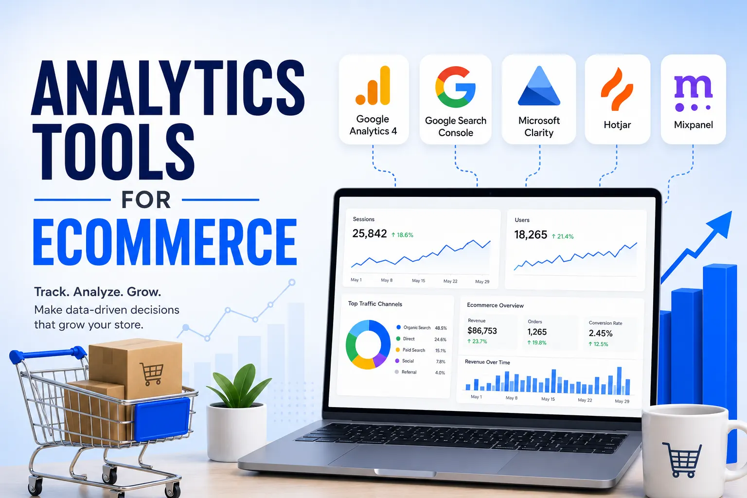
Tools for Checkout Optimization
Analytics Tools
- Google Analytics
- Hotjar
Payment Tools
- Razorpay
- PayPal
Common Checkout Mistakes to Avoid
- Hidden charges
- Slow loading pages
- Mandatory account creation
- Too many form fields
- Lack of trust signals
Checkout optimization is not a small tweak—it’s one of the biggest revenue levers in ecommerce.
Fixing even one friction point can lead to massive gains.
One-Click Checkout: The Gold Standard of Conversion
If there’s one innovation that dramatically changed ecommerce conversions, it’s one-click checkout.
Popularized by Amazon, this model removes almost all friction by allowing users to complete purchases instantly using saved details.
Why One-Click Checkout Works
It eliminates:
- Form filling
- Decision fatigue
- Payment delays
The user journey becomes:
Product → Click → Purchase complete
How to Implement It
Even if you’re not a marketplace giant, you can replicate this experience:
- Save user details securely
- Enable returning user fast checkout
- Use tokenized payment systems
Platforms like Shopify provide accelerated checkout features like Shop Pay, which significantly improves conversion rates.
Autofill, Address Detection & Smart Forms
Typing is one of the biggest friction points—especially on mobile.
Smart Form Optimization Techniques
1. Address Autocomplete
Use APIs (like Google Places) to auto-suggest addresses.
This:
- Reduces typing effort
- Minimizes errors
- Speeds up checkout
2. Auto-Fill Fields
Browsers like Google Chrome support autofill for:
- Name
- Address
Make sure your form fields are compatible.
3. Field Reduction Strategy
Instead of asking:
- First name + last name
- Address line 1 + 2
Simplify wherever possible.
Checkout UX Patterns That Increase Conversions
Let’s go beyond basics and explore patterns used by top ecommerce brands.
1. Sticky Order Summary
Always show:
- Products
- Price
- Discounts
Users feel more confident when they can review their order at any time.
2. Inline Checkout (No Page Reloads)
Modern checkout flows avoid multiple page loads.
Benefits:
- Faster experience
- Less friction
- Better mobile UX
3. Microcopy That Reduces Anxiety
Small text can have a big impact.
Examples:
- “We’ll never share your email”
- “Secure payment via encrypted gateway”
- “Free returns within 7 days”
4. CTA Optimization in Checkout
Instead of generic buttons:
Bad:
Continue
Better:
Proceed to Secure Payment
Checkout Personalization: The Next-Level Advantage
Personalization is not just for product pages—it works in checkout too.
How to Personalize Checkout
Based on Location
- Show local payment methods
- Display estimated delivery time
Based on Behavior
- Returning users → faster checkout
- New users → more trust signals
Based on Cart Value
- Offer discounts
- Suggest add-ons
Pricing & Incentive Optimization in Checkout
Checkout is the perfect place to increase conversions using pricing strategies.
1. Free Shipping Nudges
Example:
“Add ₹150 more to get free shipping”
This increases both:
- Conversion rate
- Average order value
2. Exit Discounts
When users try to leave:
- Offer 5–10% discount
- Show popup
3. Bundle Offers
Example:
“Buy 2 & save 20%”
Reducing Checkout Anxiety (Psychological Optimization)
Users hesitate at checkout because they feel risk.
Reduce Fear Using:
1. Trust Badges
- SSL secure
- Payment verified
2. Return Policy Clarity
- “No questions asked returns”
3. Delivery Assurance
- “Guaranteed delivery by [date]”
Mobile Checkout Deep Optimization
In markets like India, mobile dominates ecommerce usage.
Companies like Flipkart and Amazon India have heavily optimized mobile checkout experiences.
Mobile-Specific Improvements
1. Large Buttons
Easy tapping reduces errors.
2. Minimal Typing
Use:
- Autofill
- Dropdowns
3. Fast Loading Pages
Speed is even more critical on mobile.
Payment Optimization for Higher Conversions
Offer Region-Specific Payment Methods
In India:
- UPI (must-have)
- Wallets
- COD
Payment gateways like Razorpay provide all-in-one solutions.
Reduce Payment Failures
Ensure:
- Stable gateway
- Retry options
- Multiple payment choices
Show Payment Logos
Logos of:
- Visa
- Mastercard
- UPI
build trust instantly.
Checkout Analytics: Measuring What Matters
You can’t optimize what you don’t measure.
Key Metrics to Track
- Checkout completion rate
- Payment success rate
- Drop-off at each step
- Time to complete checkout
Tools to Use
- Google Analytics
- Hotjar
Heatmaps reveal:
- Where users stop
- Where they hesitate
Advanced A/B Testing for Checkout
Testing is where real growth happens.
What to Test
- Button text
- Checkout layout
- Number of steps
- Payment order
Example Test
Version A:
- Multi-step checkout
Version B:
- Single-page checkout
Track which performs better.
Checkout Recovery Systems (Advanced)
Even optimized checkout won’t convert everyone.
1. Abandoned Cart Emails
Send:
- Reminder
- Discount
- Urgency
2. SMS & WhatsApp Recovery
In India, WhatsApp is extremely powerful.
Use it for:
- Cart reminders
- Payment links
3. Retargeting Ads
Use:
- Meta Ads
- Google Ads
CRO Framework for Checkout Optimization
Step 1: Identify Drop-Off Points
Use analytics.
Step 2: Find Friction
Analyze UX.
Step 3: Create Hypothesis
Example:
“Reducing form fields will improve conversion”
Step 4: Test Changes
Run A/B tests.
Step 5: Scale Winners
Implement improvements.
Advanced Mistakes That Kill Checkout Conversions
Even experienced businesses fail here.
1. Overcomplicated Checkout
Too many steps = drop-offs.
2. Hidden Charges
Breaks trust instantly.
3. Slow Payment Processing
Users lose patience.
4. Poor Mobile UX
Huge loss in India.
Checkout optimization is not just UX—it’s psychology, technology, and strategy combined.
The biggest gains come from:
- Reducing friction
- Increasing trust
- Simplifying decisions
Checkout Optimization Guide to Reduce Cart Abandonment (Expert Systems & Scaling)
Real-World Checkout Optimization Case Studies (Applied Thinking)
Let’s move beyond theory and look at how real ecommerce improvements happen.
Case Study 1: Reducing Form Friction Increased Conversions by 28%
Scenario:
An ecommerce store had strong traffic and cart additions but poor checkout completion.
Problem Identified:
Using Google Analytics:
- Drop-off at address form stage
Using Hotjar:
- Users hesitated while filling long forms
Fixes Applied:
- Reduced form fields from 12 → 6
- Enabled autofill
- Added inline validation
Result:
- 28% increase in checkout completion
- Reduced user frustration
Case Study 2: Adding COD Increased Conversions in India
Scenario:
A brand targeting Indian customers struggled with low conversions.
Problem:
- Limited payment options
- Low trust
Solution:
- Added Cash on Delivery (COD)
- Integrated Razorpay
- Highlighted “Pay on Delivery”
Result:
- Conversion rate increased significantly
- Trust improved
Case Study 3: Transparent Pricing Reduced Abandonment
Problem:
Users abandoned carts at payment stage.
Cause:
- Unexpected shipping charges
Fix:
- Displayed shipping cost upfront
- Added free shipping threshold
Result:
- 20–30% reduction in abandonment
Checkout UX Templates (High-Converting Layout Structures)
Instead of guessing design, follow proven templates.
Template 1: Minimal Checkout Layout
Best for:
- Mobile users
- Fast purchases
Structure:
- Cart summary (top)
- Address
- Payment
- CTA
Template 2: Two-Step Checkout
Step 1:
- Shipping details
Step 2:
- Payment
Add progress indicator for clarity.
Template 3: Express Checkout
For returning users:
- Autofill details
- One-click payment
Used effectively by Amazon and Shopify stores.
SaaS Checkout Tools Comparison (What to Use)
Ecommerce Platforms
Shopify
- Fast checkout
- Built-in optimization
- Shop Pay
BigCommerce
- Customizable checkout
- Scalable for large stores
Payment Solutions
Razorpay
- UPI, cards, wallets
- Best for Indian market
PayPal
- Global trust
- International payments
Checkout Conversion Benchmarks
Understanding benchmarks helps you evaluate performance.
Industry Averages
- Cart abandonment: 60%–80%
- Checkout conversion: 20%–40%
High-Performing Stores
- Abandonment < 50%
- Fast checkout time (< 60 seconds)
Top brands like Amazon achieve this through continuous optimization.
Advanced Behavioral Psychology in Checkout
1. Loss Aversion
People fear losing more than gaining.
Example:
“Your cart items are almost sold out”
2. Commitment Bias
Once users add to cart, they are mentally committed.
Your job:
- Make checkout frictionless
3. Trust Reinforcement
At checkout, reinforce trust repeatedly:
- Secure badges
- Guarantees
- Reviews
4. Decision Simplification
Too many choices = confusion.
Keep:
- Payment options clear
- UI simple
SEO + Checkout Integration (Underrated Strategy)
Most people ignore this.
Why It Matters
Users coming from SEO:
- Have high intent
- Are closer to purchase
How to Align SEO + Checkout
- Match landing page with checkout offer
- Maintain consistent messaging
- Avoid surprises
Example:
If SEO page says:
“Free Shipping”
Checkout must reflect the same.
Conversion-Focused Checkout Copywriting
Words matter—especially at checkout.
Examples
Instead of:
Submit
Use:
Complete Secure Order
Instead of:
Continue
Use:
Proceed to Payment
Microcopy Examples
- “No hidden charges”
- “100% secure checkout”
- “Easy returns”
Checkout Optimization for Different Business Models
1. Low-Ticket Products
Focus:
- Speed
- Simplicity
2. High-Ticket Products
Focus:
- Trust
- Guarantees
- Detailed info
3. Subscription Models
Focus:
- Easy signup
- Clear billing
Scaling Checkout Optimization (From Tactics to System)
Most businesses apply random fixes. That doesn’t scale.
Build a System
Step 1: Data Collection
Track behavior.
Step 2: Insight Analysis
Identify friction.
Step 3: Hypothesis Creation
Example:
“Adding COD will increase conversions”
Step 4: Testing
Run experiments.
Step 5: Scaling
Implement winning changes.
High-Impact Quick Wins (Immediate ROI)
If you want fast results:
- Enable guest checkout
- Add COD (India)
- Reduce form fields
- Show shipping cost early
- Improve mobile UX
These alone can increase conversions significantly.
Common Myths About Checkout Optimization
Myth 1: More Steps = More Clarity
Wrong. More steps = more drop-offs.
Myth 2: Discounts Always Work
Overuse reduces brand value.
Myth 3: Checkout Is Just Design
It’s psychology + UX + trust.
Final Conclusion: The Checkout Growth Formula
Checkout optimization is where revenue is won or lost.
The Winning Formula
Friction Reduction + Trust Building + Speed + Clarity = Higher Conversions