Blog
Mobile Optimization for Ecommerce Stores

The Complete Guide to Faster, Smarter, and Higher-Converting Mobile Shopping Experiences
Introduction
Mobile commerce has transformed the way people discover, compare, and purchase products online. Consumers no longer depend on desktop computers for online shopping because smartphones have become the primary device for browsing ecommerce stores, researching products, reading reviews, checking prices, and completing transactions. Whether someone is buying fashion products, electronics, groceries, beauty items, furniture, or digital services, the shopping journey often begins and ends on a mobile device.
According to reports from platforms like Shopify, Statista, and BigCommerce, mobile commerce contributes a massive share of global ecommerce revenue. Modern customers expect fast-loading pages, smooth navigation, responsive layouts, simplified checkout experiences, and frictionless interactions across every stage of the buying process. If an ecommerce website fails to meet these expectations, users quickly abandon the site and move to competitors.
This shift in user behavior means mobile optimization is no longer optional. It is one of the most important factors influencing ecommerce success, search engine visibility, customer retention, and conversion rates. Businesses that ignore mobile performance risk losing sales, organic rankings, customer trust, and long-term brand loyalty.
Official Resources:
- https://www.bigcommerce.com/articles/ecommerce/mobile-commerce/
- https://developers.google.com/search/mobile-sites
- https://www.shopify.com/in/blog/mobile-commerce
In this comprehensive guide, you will learn everything about mobile optimization for ecommerce stores, including responsive design, mobile SEO, checkout optimization, speed improvements, image optimization, mobile UX strategies, Core Web Vitals, mobile navigation, conversion optimization, and future trends shaping mobile ecommerce.
Understanding Mobile Ecommerce
What Is Mobile Ecommerce?
Mobile ecommerce, commonly called mCommerce, refers to buying and selling products through smartphones and tablets. It includes browsing products, reading descriptions, comparing prices, adding products to carts, making payments, tracking orders, and interacting with customer support using mobile devices.
Modern mobile commerce includes:
- Mobile-responsive ecommerce websites
- Progressive Web Apps (PWAs)
- Mobile shopping apps
- Social commerce platforms
- Voice-assisted shopping
- One-click mobile payments
- Mobile wallet integrations
The growth of affordable smartphones and high-speed internet has dramatically increased the number of mobile shoppers worldwide. Consumers now expect ecommerce stores to deliver a seamless mobile experience regardless of screen size, operating system, or internet connection speed.
Why Mobile Optimization Matters for Ecommerce Stores
Many ecommerce businesses still focus heavily on desktop design while treating mobile optimization as a secondary consideration. This approach creates poor user experiences that negatively affect conversions.
Mobile optimization directly impacts:
Conversion Rates
A mobile-friendly ecommerce store removes friction during the buying process. Users can quickly browse categories, find products, view images, read reviews, and complete checkout without frustration.
Bounce Rate
Slow-loading mobile pages increase bounce rates significantly. If pages take too long to load, visitors often leave before interacting with the content.
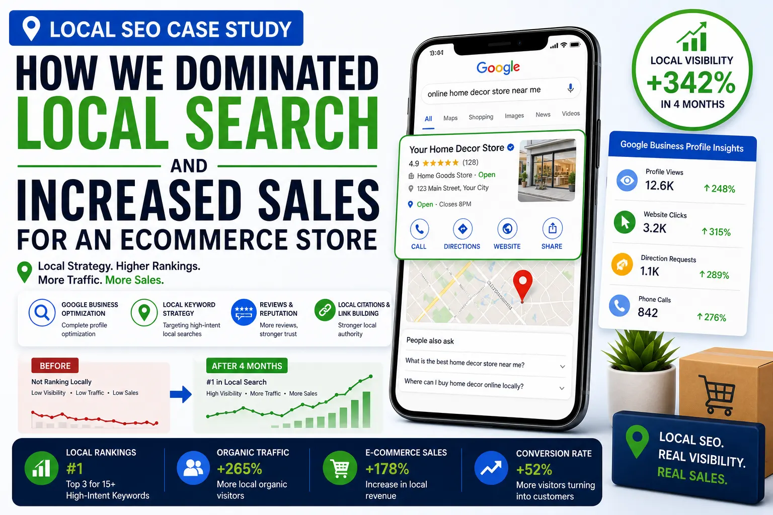
Search Engine Rankings
Google uses mobile-first indexing, meaning the mobile version of your site is prioritized for indexing and ranking. Poor mobile performance can reduce organic visibility.
Official Resource:
Customer Trust
Users associate website quality with brand credibility. A poorly optimized mobile store can make even high-quality businesses appear outdated or untrustworthy.
Revenue Growth
Mobile optimization increases customer engagement, improves product discovery, reduces checkout abandonment, and drives higher sales.
Mobile-First Design for Ecommerce Websites
What Is Mobile-First Design?
Mobile-first design is a web design approach where designers and developers create the mobile version of a website before designing for larger screens. Instead of shrinking desktop layouts for smaller devices, mobile-first design prioritizes the mobile experience from the beginning.
This strategy ensures:
- Cleaner interfaces
- Faster loading times
- Better usability
- Simplified navigation
- Higher mobile engagement
Key Principles of Mobile-First Ecommerce Design
Prioritize Essential Content
Mobile screens have limited space, so ecommerce websites must focus on displaying the most important content first.
Essential elements include:
- Product images
- Product titles
- Pricing
- Add-to-cart buttons
- Ratings and reviews
- Delivery information
- CTA buttons
Avoid cluttering mobile screens with excessive banners, unnecessary animations, or distracting popups.
Use Responsive Design
Responsive web design ensures that layouts automatically adjust to different screen sizes and orientations.
Google recommends responsive design because it improves usability and simplifies indexing.
Official Resource:
Simplify User Journeys
Mobile users expect minimal effort when navigating ecommerce stores. Simplify category structures, menus, search functionality, and checkout processes.
Optimize Touch Elements
Buttons, menus, and interactive elements should be large enough for easy tapping.
Best practices include:
- Minimum button size of 44×44 pixels
- Proper spacing between clickable elements
- Thumb-friendly navigation
- Sticky navigation bars
Mobile Website Speed Optimization
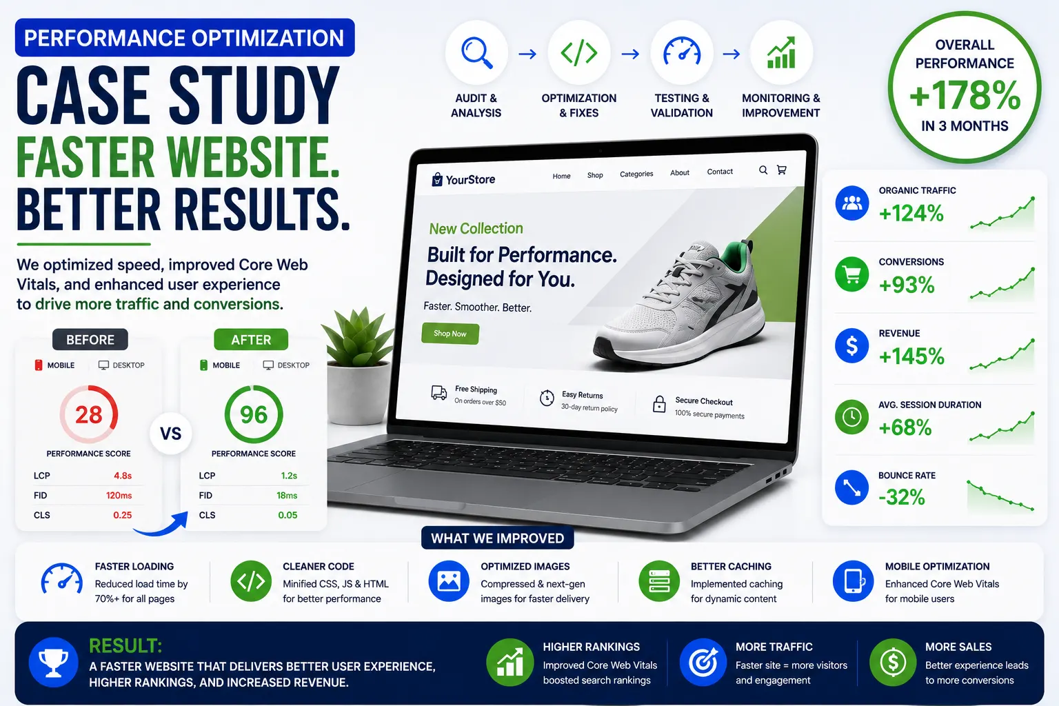
Why Speed Matters in Mobile Ecommerce
Page speed is one of the most critical factors affecting ecommerce performance. Mobile users expect websites to load almost instantly.
Even small delays can result in:
- Higher bounce rates
- Reduced conversions
- Lower search rankings
- Poor user experiences
- Increased cart abandonment
Research from Google shows that conversion rates drop significantly as page load times increase.
Official Resource:
Techniques to Improve Mobile Ecommerce Speed
Optimize Images
Images are often the largest files on ecommerce websites.
Use modern image formats such as:
- WebP
- AVIF
Compress images without sacrificing quality.
Recommended Tools:
Implement Lazy Loading
Lazy loading delays image loading until users scroll near the image.
Benefits include:
- Faster initial page loads
- Reduced bandwidth usage
- Better Core Web Vitals scores
Minify CSS and JavaScript
Reduce unnecessary code to improve performance.
Tools:
Use a Content Delivery Network (CDN)
CDNs store website assets across global servers to reduce loading times.
Popular CDN Providers:
Reduce HTTP Requests
Too many requests slow down mobile websites. Combine CSS files, reduce plugins, and remove unnecessary scripts.
Enable Browser Caching
Caching allows returning visitors to load websites faster by storing assets locally.
Use High-Performance Hosting
Reliable hosting improves server response times and scalability.
Recommended Ecommerce Hosting Platforms:
Mobile User Experience (UX) for Ecommerce
Importance of Mobile UX
Mobile UX determines how users interact with ecommerce websites. A poor user experience leads to frustration and abandonment.
Good mobile UX improves:
- Engagement
- Conversion rates
- Customer satisfaction
- Brand trust
- Retention
Mobile Navigation Best Practices
Use Clear Menus
Complicated menus overwhelm users.
Best practices:
- Use hamburger menus carefully
- Keep categories simple
- Prioritize top-selling categories
- Add search functionality
Sticky Navigation
Sticky headers and navigation bars improve accessibility.
Users can quickly:
- Search products
- Access carts
- Open menus
- Navigate categories
Mobile Search Optimization
Search is one of the most important ecommerce features.
Improve mobile search by:
- Adding autocomplete suggestions
- Supporting typo correction
- Showing recent searches
- Using predictive search
- Displaying product thumbnails in search results
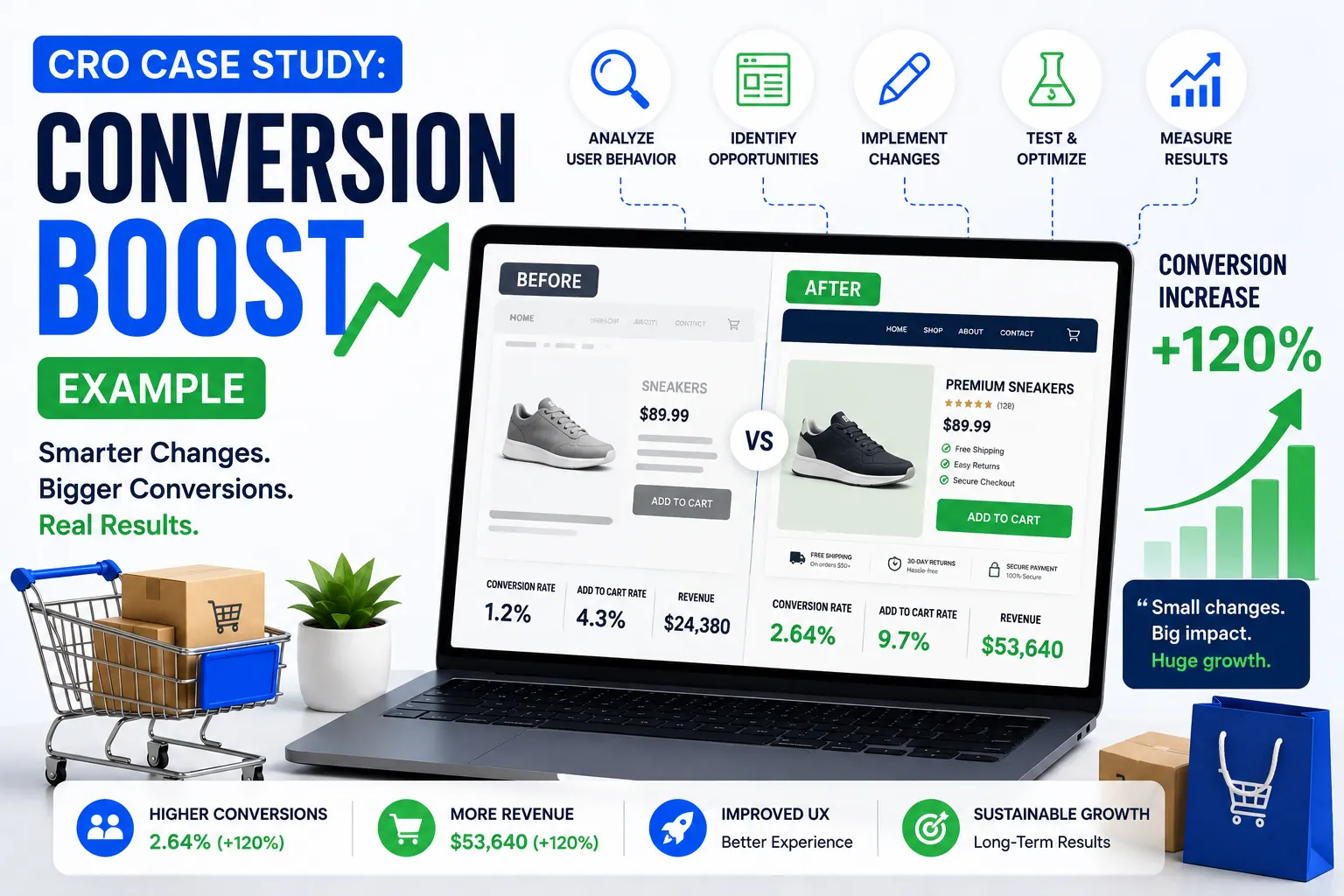
Product Page Optimization for Mobile
Product pages directly affect conversion rates.
High-Quality Product Images
Use:
- Zoom functionality
- Swipe galleries
- 360-degree views
- Multiple angles
- Lifestyle images
Clear Product Descriptions
Mobile descriptions should be concise but informative.
Include:
- Key features
- Specifications
- Benefits
- Materials
- Delivery information
- Return policies
Strong CTA Buttons
Add-to-cart buttons should:
- Be visible above the fold
- Use contrasting colors
- Remain sticky while scrolling
Mobile Reviews and Ratings
Customer reviews increase trust and influence buying decisions.
Display:
- Star ratings
- Photo reviews
- Verified buyer badges
- Review summaries
Mobile Checkout Optimization
Why Mobile Checkout Is Critical
Many ecommerce stores lose potential customers during checkout because of complicated mobile experiences.
Common issues include:
- Long forms
- Forced account creation
- Slow loading pages
- Payment failures
- Poor button placement
Strategies for Mobile Checkout Optimization
Enable Guest Checkout
Forcing users to create accounts increases abandonment.
Guest checkout simplifies purchases and improves conversions.
Minimize Form Fields
Reduce unnecessary input requirements.
Best practices:
- Use autofill
- Enable address lookup
- Use dropdowns where appropriate
- Support one-tap input
Mobile Payment Integration
Support fast payment methods such as:
- Apple Pay
- Google Pay
- PayPal
- UPI
- Shop Pay
Official Resources:
Progress Indicators
Show checkout progress clearly.
Example:
- Cart
- Shipping
- Payment