Blog
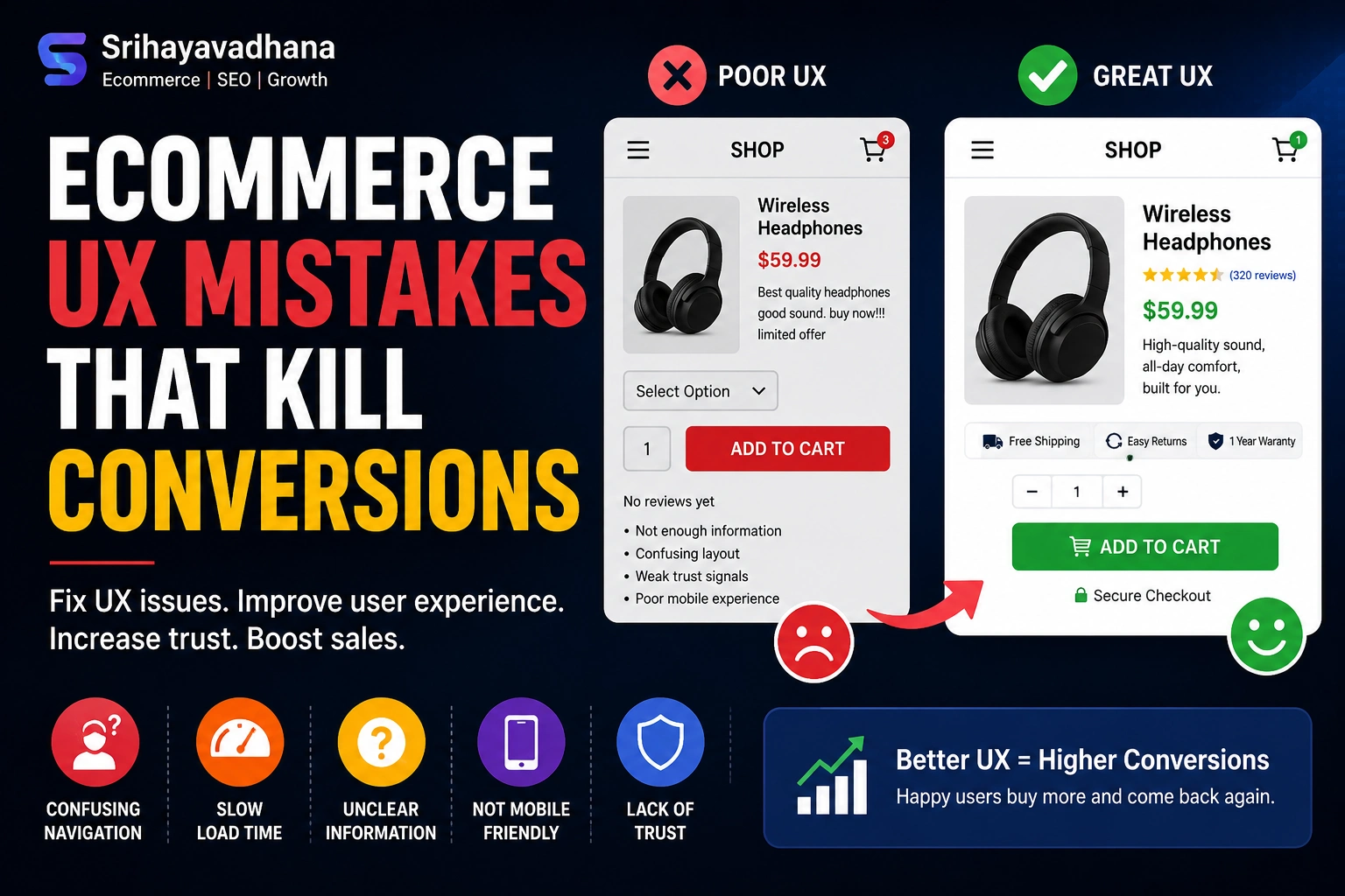
Ecommerce UX Mistakes That Kill Conversions
The Silent Conversion Killers: Why UX is Your Most Important Sales Lever
In the hyper-competitive landscape of 2026, the difference between a thriving digital storefront and a struggling one isn’t just the product or the price—it’s the User Experience (UX). While marketing brings people to the door, UX is what ensures they walk in, browse, and ultimately complete a purchase.
Modern consumers have a lower tolerance for digital friction than ever before. According to recent industry benchmarks, even a 100-millisecond delay in load time can result in a 7% drop in conversions. When a user encounters a “mistake”—whether it’s a confusing menu or a forced account creation—it isn’t just a minor annoyance; it’s a psychological trigger that signals your brand is untrustworthy or difficult to work with.
Below, we dissect the most pervasive Ecommerce UX mistakes, backed by data and psychological principles, and provide the “BigCommerce-style” deep dives needed to fix them.
The “Invisible” Search Bar: Failing the High-Intent Shopper
One of the most catastrophic UX mistakes is neglecting the Site Search functionality. On average, users who use the search bar are 1.8 times more likely to convert than those who simply browse. These are your highest-intent customers; they know what they want, and they are looking for a direct path to it.
The Mistake: Small, Hidden, or Dumb Search Fields
Many designers prioritize “minimalist aesthetics” by hiding the search bar behind a tiny magnifying glass icon or placing it in an unconventional corner. Furthermore, “dumb” search engines that cannot handle typos, synonyms (e.g., “sneakers” vs. “running shoes”), or natural language queries (e.g., “blue summer dress under $50”) create a dead-end experience.
The Fix: Proactive and Predictive Discovery
To cater to the “searcher” persona, your search bar should be:
-
Prominent and Persistent: Place it centrally or in the top-right, and keep it “sticky” as the user scrolls.
-
Typo-Tolerant: Implement fuzzy search logic so that “iPhne” still brings up the iPhone.
-
Visual Autocomplete: As users type, show them product thumbnails and category suggestions. This reduces cognitive load and speeds up the “Time to Product.”
The Multi-Step Checkout “Wall”
Cart abandonment is the bane of the ecommerce industry, with rates often hovering around 70%. While some abandonment is natural (window shopping), a significant portion is caused by a friction-heavy checkout process.
The Mistake: Forced Registration and Excessive Fields
Nothing kills a sale faster than requiring a user to “Create an Account” before they can give you money. This introduces a massive psychological barrier. Additionally, asking for redundant information—like asking for the “State” when the Zip Code already identifies it—exhausts the user’s “interaction budget.”
The Fix: The Frictionless “Guest” Path
The gold standard for modern ecommerce is the Single-Page Checkout or a highly optimized multi-step flow with a progress bar.
-
Guest Checkout by Default: Allow users to buy first and offer to save their details after the purchase.
-
Address Autocomplete: Use APIs like Google Maps to allow users to find their address in two clicks.
-
Inline Validation: Don’t wait until the user hits “Submit” to tell them their email is missing an “@” symbol. Show green checkmarks in real-time to provide positive reinforcement.
Neglecting “Thumb-Zone” Mobile Design
As of 2026, mobile devices account for over 75% of ecommerce traffic. However, many sites are still “shrunken-down desktops” rather than mobile-first experiences.
The Mistake: Small Tap Targets and Non-Responsive Elements
If a user has to “pinch and zoom” to read a product description or hit a tiny “Add to Cart” button, they will leave. Furthermore, many sites fail to account for the “Thumb Zone”—the area of the screen most easily reached by a thumb when holding a phone with one hand.
The Fix: Adaptive, Thumb-Friendly Interfaces
Designing for mobile means prioritizing the lower half of the screen for critical actions.
-
Sticky Add-to-Cart: Keep the primary CTA (Call to Action) at the bottom of the viewport so it’s always accessible.
-
Mobile Wallets: Integrate Apple Pay, Google Pay, and Shop Pay. Eliminating the need for a user to pull out a physical credit card on a train or couch can increase mobile conversion rates by up to 20%.
Hidden Fees: The Transparency Trap
Transparency is the bedrock of digital trust. The #1 reason for abandonment during the checkout phase is unexpected costs (shipping, taxes, fees).
The Mistake: “Price Shock” at the Final Step
When a user sees a $50 item, spends five minutes entering their data, and only then discovers a $15 shipping fee, they feel misled. This “Price Shock” creates a negative emotional response, leading them to abandon the cart out of principle.
The Fix: Radical Upfront Transparency
Successful retailers use Dynamic Shipping Calculators on the product page itself.
-
Free Shipping Thresholds: Clearly state “Spend $10 more for Free Shipping” to increase Average Order Value (AOV).
-
Calculated Taxes: Use geo-location to estimate taxes and shipping early in the funnel, ensuring the price on the PDP (Product Detail Page) is as close to the final price as possible.
Weak Product Imagery and Lack of Context
In a physical store, a customer can touch the fabric, check the weight, and see the scale of an item. Online, your Product Detail Page (PDP) must bridge this sensory gap.
The Mistake: Low-Resolution or Static Images
Using a single, flat image of a product on a white background is no longer enough. Users need to see the “reality” of the product. If they can’t visualize how a couch fits in a living room or how a watch looks on a wrist, the uncertainty leads to “no-sale.”
The Fix: Immersive Visual Storytelling
To maximize conversions, your PDP should act as a virtual showroom.
-
Lifestyle Photography: Show the product in use. This provides context and scale.
-
User-Generated Content (UGC): Integrating a customer photo gallery builds massive social proof.
-
Video and 360° Views: A short 10-second video of a model walking in a dress can reduce return rates significantly because the customer has a better understanding of how the fabric moves.
Poor Information Architecture (IA) and “Category Overload”
If a customer can’t find it, they can’t buy it. Over-complicating your navigation is a surefire way to increase your bounce rate.
The Mistake: Too Many Top-Level Menu Items
“Hick’s Law” states that the time it takes to make a decision increases with the number and complexity of choices. When an ecommerce site has 15 different top-level categories, it overwhelms the brain.
The Fix: Flattened Navigation and Faceted Search
Organize your store using a clear, hierarchical structure
-
Mega-Menus: Use visual mega-menus that group sub-categories logically (e.g., “Men’s” -> “Shoes” -> “Boots”).
-
Faceted Filtering: Allow users to narrow down 1,000 products to 5 using filters like size, color, material, and price. Crucially, ensure that filters are mutually exclusive and updated in real-time without a full page reload.
Ignoring Accessibility (The Ethical and Financial Mistake)
Accessibility is no longer an “extra”; it is a requirement. Ignoring WCAG (Web Content Accessibility Guidelines) doesn’t just alienate millions of potential customers with visual or motor impairments—it also hurts your SEO and exposes you to legal risks.
The Mistake: Low Contrast and Non-Descriptive Alt-Text
Many “trendy” sites use light gray text on white backgrounds, which is unreadable for many users. Others fail to use proper HTML tags, making it impossible for screen readers to navigate the checkout.
The Fix: Universal Design
-
High Contrast: Ensure a contrast ratio of at least 4.5:1 for text.
-
Keyboard Navigation: A user should be able to navigate your entire site and complete a purchase using only the “Tab” and “Enter” keys.
-
Descriptive Alt-Text: Every product image should have descriptive text (e.g., “Men’s leather Chelsea boot in chocolate brown”) which helps both visually impaired users and search engine crawlers.
Conclusion: The Continuous Optimization Loop
Ecommerce UX is not a “set it and forget it” project. It is a process of continuous iteration. The biggest mistake of all is assuming you know what your users want without looking at the data.
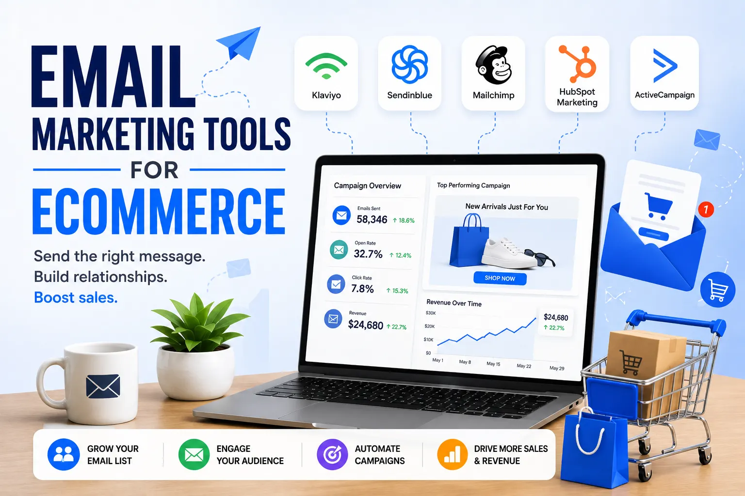
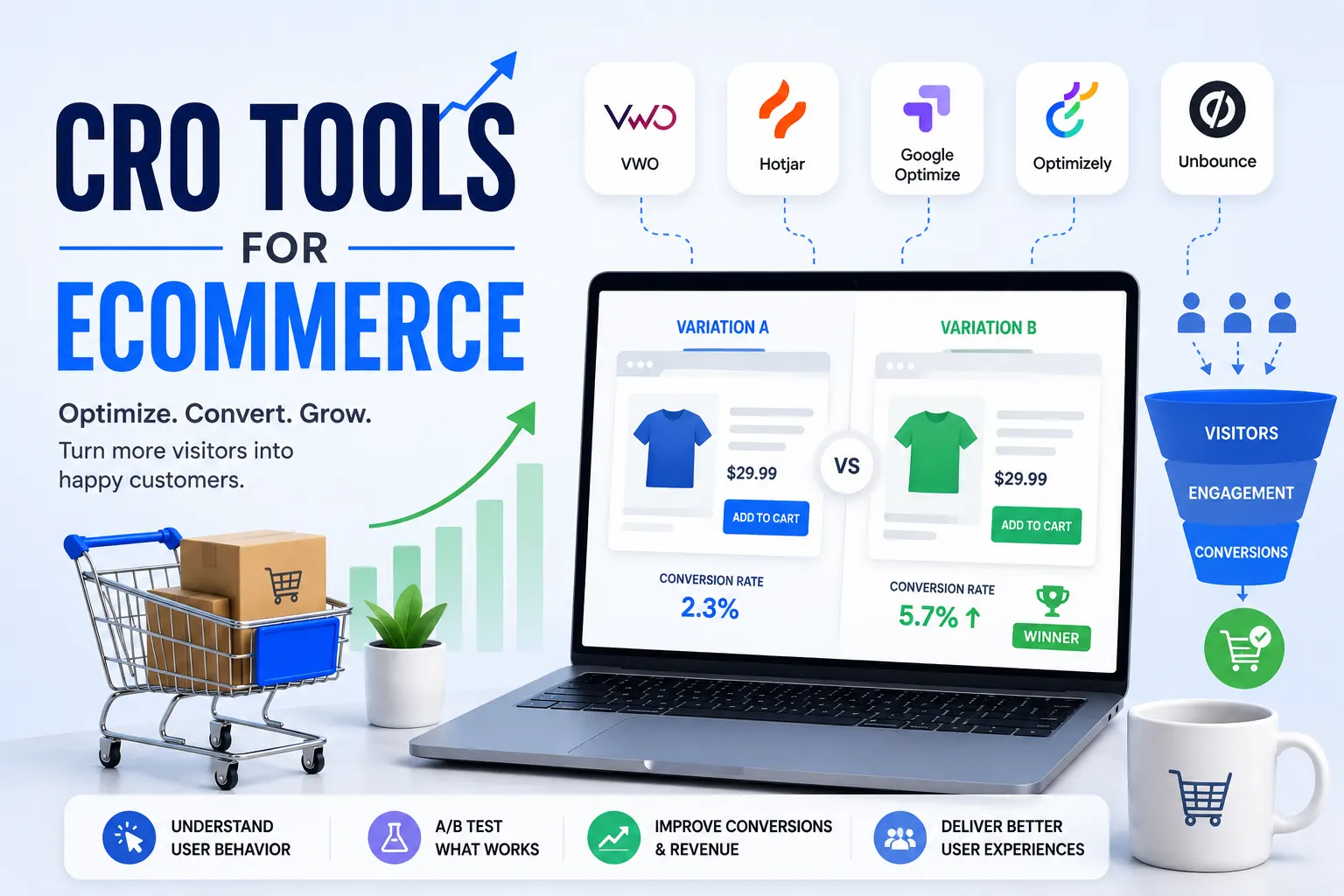
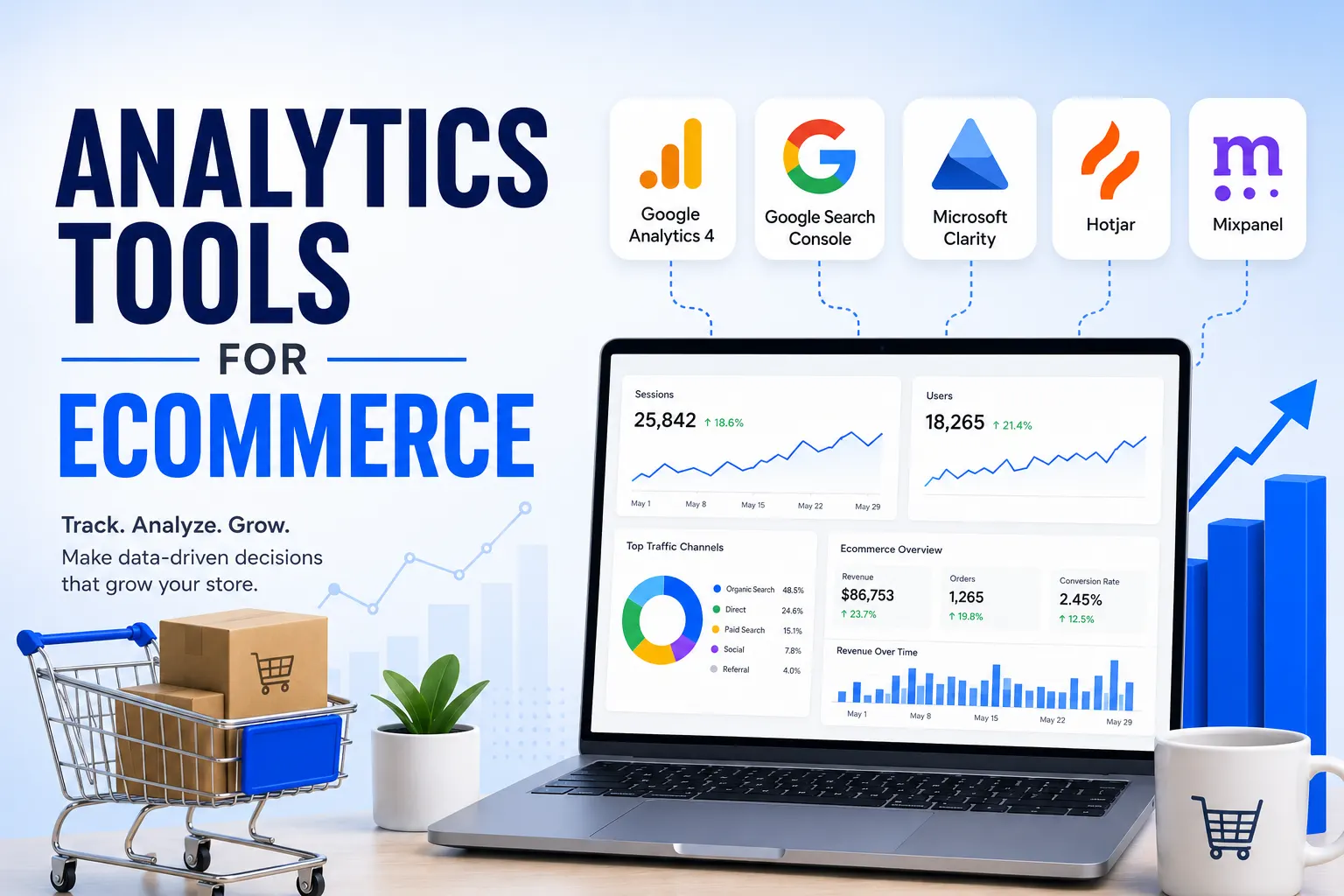
By leveraging tools like Heatmaps (Hotjar), Google Analytics 4 (GA4), and A/B Testing, you can identify exactly where users are “tripping” and smooth out the path to purchase. In the end, the most successful ecommerce brands are those that treat their website not as a catalog, but as a high-performance service designed to make the customer’s life easier.