Blog
Product Page Optimization That Boosts Sales – An Exclusive Guide
Product Page Optimization That Boosts Sales
Your product page is the single most important real estate in your entire ecommerce operation. It’s the moment of truth — the page where a visitor either becomes a customer or disappears forever, often to a competitor. Yet most ecommerce stores treat product pages as a formality: upload a few photos, paste in the manufacturer’s description, set a price, and call it done. That approach leaves an enormous amount of revenue on the table every single day.
Product page optimization is the practice of systematically improving every element of your product detail pages (PDPs) to increase the percentage of visitors who make a purchase, increase the average value of those purchases, and reduce the friction and doubt that causes otherwise-willing buyers to abandon before checkout. It sits at the intersection of design, copywriting, psychology, data analysis, and user experience — and when done well, it’s one of the highest-ROI activities available to an ecommerce business because it improves revenue from your existing traffic without requiring a single additional dollar in advertising spend.
This guide is a complete, deeply detailed resource for anyone who wants to understand product page optimization at a level beyond surface-level tips. We’ll cover every major element of a product page — imagery, copy, pricing, calls to action, social proof, trust signals, page speed, mobile experience, SEO, and more — with practical guidance, the psychological reasoning behind each recommendation, and real-world context for how these principles apply to different ecommerce categories. Whether you’re running a Shopify store, a WooCommerce site, a BigCommerce build, or a custom platform, the principles in this guide apply universally.
Why Product Pages Are Your Most Valuable Conversion Asset
To understand why product page optimization deserves priority attention, it helps to think about the journey a visitor takes before arriving on one. They may have clicked a paid ad, found you through organic search, followed a recommendation from a friend, or clicked through from an email campaign. By the time they land on a product page, they’ve already expressed intent — they’re interested in what you’re selling. The product page’s job is not to generate interest; interest already exists. Its job is to convert that interest into a confident, committed purchase decision.
This makes the product page categorically different from your homepage or blog content, which serve awareness and consideration goals. The PDP is a sales page. Every element on it should serve the goal of answering the visitor’s questions, addressing their objections, building their confidence, and making the path to purchase as frictionless as possible. When you frame it this way, it becomes obvious that optimizing your product pages is essentially optimizing your sales process — and most businesses would agree that investing in their sales process is one of the highest-leverage activities they can undertake.
The economics of product page optimization are also compelling. If your store receives 50,000 product page views per month and converts at 2.5%, you’re generating 1,250 purchases. If a systematic optimization effort improves that rate to 3.25% — a realistic 30% relative lift over time — you’re generating 1,625 purchases per month from the same traffic. At an average order value of $75, that’s an additional $28,125 in monthly revenue, or roughly $337,500 per year, without spending more on acquisition. The compounding effects of this kind of improvement justify making product page optimization a standing priority rather than a one-time project.
Understanding Your Visitor Before You Optimize Anything
The most effective product page optimizations don’t come from design trends or competitor copying — they come from a deep understanding of who your visitors are, what they already know when they arrive, what questions they have, and what doubts are holding them back. Before you move a single pixel or rewrite a single sentence, invest in understanding your customer’s buying psychology.
Qualitative Research: Hearing from Your Customers Directly
The fastest way to understand what’s stopping visitors from converting is to ask them. On-site surveys using tools like Hotjar, Qualaroo, or Survicate can pose targeted questions to product page visitors: “What’s stopping you from making a purchase today?” or “What information are you looking for that you haven’t found?” The answers to these questions are pure gold for product page optimization because they tell you, in your customers’ own words, exactly where your page is falling short.
Customer support tickets and live chat transcripts are another underutilized research source. If you repeatedly see the same questions coming through — about sizing, materials, shipping times, compatibility, or return policies — those questions represent information gaps on your product pages that are costing you conversions every day. Plugging those gaps is often the highest-ROI thing you can do.
Post-purchase surveys are equally valuable. Asking customers “What almost stopped you from buying?” and “What was the most important factor in your decision?” reveals both the friction you overcame and the persuasion levers that worked. Over time, this data shapes a clear picture of your customer’s decision-making process that guides every optimization decision you make.
Quantitative Research: Following the Data Trail
Alongside qualitative insights, your analytics data tells you exactly where visitors are struggling on your product pages. In Google Analytics 4, scroll depth reports show how far down the page the average visitor reads — if most visitors never see your shipping information because it’s buried at the bottom of a long description, that’s a layout problem you can solve. Funnel reports show the drop-off rates between product page views, add-to-cart events, and checkout initiation, helping you understand whether your product page problem is primarily a persuasion problem or a friction problem.
Heatmaps and click maps reveal which elements visitors are actually engaging with versus ignoring. If your product images get intense click attention but visitors almost never interact with your sizing guide tab, that suggests either that the tab is hard to find or that visitors are trying to find sizing information in the images themselves — a navigation and information architecture problem. Session recordings — which let you watch anonymized video of actual visitor sessions — are particularly revealing for understanding mobile behavior, where small frustrations like tiny buttons, hard-to-zoom images, and multi-tap navigation flows cause outsized abandonment rates.
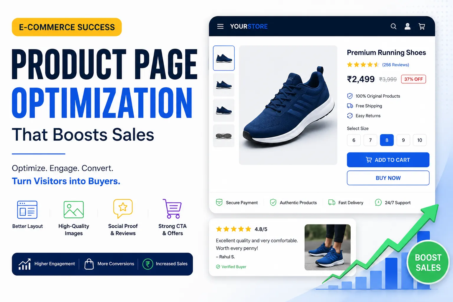
Product Photography and Visual Media: The First and Most Powerful Impression
In ecommerce, visitors cannot touch, hold, smell, or try on your products. Photography is the closest proxy to physical experience that you have, and it is consistently the single most influential factor in a visitor’s purchase decision. The investment in excellent product photography pays dividends in conversion rate improvements that almost no other single optimization can match.
Image Quality, Quantity, and Variety
High-resolution images are table stakes in 2025. Every product image should be sharp enough that visitors can zoom in to examine texture, stitching, material quality, or fine details — because that zooming behavior is itself a strong signal of purchase intent, and frustrating it with blurry images breaks the momentum of consideration. Modern ecommerce platforms support zoom functionality natively, but it’s only valuable if your source images are high enough resolution to reward the interaction.
The number of images matters as much as the quality. Research and industry data consistently show that the more images a product page includes — up to a meaningful point — the higher the conversion rate. A single hero image tells visitors almost nothing. A gallery of eight to twelve images covering multiple angles, close-up details, lifestyle contexts, scale references, and usage scenarios gives visitors the visual confidence they need to feel like they understand what they’re buying. For fashion and apparel specifically, showing a product on multiple body types significantly reduces return rates and purchase hesitation.
The variety of your imagery should map to the specific questions your customers have. If you sell furniture, a scale reference image showing the piece in a realistically sized room helps visitors understand dimensions in a way that numbers alone don’t achieve. If you sell technical products, annotated images that label key features help visitors connect the visual presentation to the copy. If you sell food or consumables, close-up texture shots and serving suggestion photographs address the sensory imagination that drives conversion in those categories.
Lifestyle Photography vs. Product-on-White
Both styles serve different but complementary purposes, and the most effective product pages use both. Product-on-white photography is clean, professional, and comparison-friendly — it’s what customers expect to see when they’re evaluating features and comparing options. Lifestyle photography — showing the product in real-world use — is emotionally resonant and aspirational. It answers the question “What would my life look like with this product in it?” which is often the question that converts consideration into commitment.
The optimal balance between these styles varies by category. For fashion, beauty, and home goods — categories driven largely by aspiration and aesthetic appeal — lifestyle photography often carries more conversion weight. For electronics, tools, and technical products — categories driven by function and specification confidence — detailed product photography with feature callouts tends to be more persuasive. The best approach is to test both and let your specific audience’s behavior guide the balance.
Product Videos and Their Conversion Impact
Product videos are one of the most underutilized tools in ecommerce product page optimization, and the brands that invest in them consistently report significant conversion rate improvements. A short product video — even 30 to 60 seconds — can communicate texture, scale, movement, assembly, and use context in ways that static photography simply cannot. For categories like fashion (where fit and drape matter enormously), home goods (where size and proportion are hard to judge from photos), and technology (where user experience needs to be shown rather than described), video is not a nice-to-have feature but a genuine conversion lever.
Wistia and Vimeo both provide ecommerce-friendly video hosting with analytics, autoplay controls, and embedding options that keep page load performance manageable. User-generated video content — customers filming their unboxing and first impressions — is particularly powerful because it combines the authenticity of real-world use with the social proof of a genuine customer recommendation. Platforms like Yotpo and Okendo now make it easy to collect and display video reviews directly on product pages.
360-Degree Views and Augmented Reality
More sophisticated visual media — including 360-degree product rotation and augmented reality (AR) try-on or placement features — are increasingly accessible for ecommerce brands and consistently demonstrate conversion rate improvements in categories where spatial understanding is important. Shopify’s AR functionality, Threekit, and Vertebrae are among the platforms enabling AR experiences that allow customers to place furniture in their rooms or virtually try on glasses and jewelry. Studies by Shopify have reported that products with 3D and AR experiences see conversion rates significantly higher compared to those without, though this varies by category and implementation quality.
Product Copy That Actually Sells
If photography addresses the emotional and sensory dimensions of a buying decision, copy addresses the rational and reassuring dimensions. Great product copy answers the customer’s practical questions, speaks directly to their specific desires and concerns, and does so in a voice that feels consistent with the brand. Poor product copy — generic manufacturer descriptions, jargon-heavy specification dumps, or conversely, vague fluffy language with no real information — is one of the most common and most fixable causes of poor product page conversion.
Writing a Product Title That Works for SEO and Conversion
Your product title serves double duty: it tells search engines what your product is (critical for organic discovery) and it tells visitors immediately whether they’ve landed on the right product (critical for conversion). An effective product title includes the brand name where relevant, the specific product name, the key descriptive attribute that matters most to the buyer (size, color, material, capacity), and occasionally a model number for technical products where shoppers use that to search.
The mistake many stores make is either being too minimal (just a product name with no context) or too maximal (keyword-stuffing a title with every possible search term until it reads like a robot wrote it). The sweet spot is a title that reads naturally to a human while including the specific words that your target customer would type into a search engine. Ahrefs and Semrush both have keyword research tools that help you identify exactly which phrases your target customers use when searching for products like yours.
Writing Product Descriptions That Convert
Most product descriptions fail at a fundamental level: they describe the product instead of selling it. The difference is significant. Describing a product means listing its features: “This jacket has a waterproof shell, 800-fill-power down insulation, and a zippered chest pocket.” Selling a product means translating those features into the experiences and benefits they create for the customer: “Stay genuinely warm and dry on the mountain without bulking up — the 800-fill down traps heat efficiently so you can move freely, and the waterproof shell handles whatever the weather throws at you.” The second version speaks to the emotional outcome — warmth, freedom, protection — while the first just reports specifications.
The benefits-over-features framework is one of the most consistently validated principles in sales copywriting, and it applies directly to product pages. For every feature you list, ask: “So what does this mean for the customer? What does it allow them to do, feel, or experience that they couldn’t before?” The answer to that question is your benefit, and benefits convert browsers into buyers.
Effective product descriptions also speak to the specific person most likely to buy. This requires knowing your customer well enough to write to them directly. A product description for a high-performance trail running shoe written for a competitive ultramarathoner should read completely differently from one written for a weekend hiker — even if the product is the same shoe. The vocabulary, the concerns addressed, the benefits emphasized, and the tone of voice should all reflect a clear picture of who the ideal customer is. This specificity is what makes copy feel like it was written for “me” rather than for “everyone,” and that sense of personal relevance dramatically increases conversion intent.
Description Length, Format, and Scannability
The appropriate length for a product description depends on several factors: the complexity of the product, the price point, the level of consideration involved in the purchase, and the role your SEO strategy plays. High-consideration, high-price products — furniture, electronics, outdoor gear, wellness products — warrant longer, more detailed descriptions because buyers research them thoroughly and want comprehensive information before committing. Low-consideration, low-price products — accessories, consumables, simple apparel basics — can often be served well by shorter, more direct descriptions.
Regardless of length, the format of your description should aid scannability. Most visitors don’t read product descriptions word by word — they scan for the information that matters to them. Using a short opening paragraph that leads with the most compelling benefit or use case, followed by a bulleted list of key features and specifications, and optionally followed by a deeper narrative section for buyers who want more detail, serves both the scanner and the thorough reader. The bulleted feature list should be genuinely informative — not vague filler like “high quality construction” but specific, meaningful details like “welded seams rated to 10,000mm water column pressure.”
Long-Tail SEO Through Product Copy
Product descriptions are a primary vehicle for organic search optimization, and the stores that treat them as purely functional content miss a significant traffic opportunity. Long-tail keyword phrases — the specific, multi-word searches that reflect high purchase intent — are most naturally woven into product descriptions and extended content sections. A visitor who searches for “lightweight waterproof hiking jacket for women with hood” is in full buying mode, and your product page has the opportunity to be exactly the right answer to that query if your description naturally includes those terms in context.
Tools like Google’s Keyword Planner, Ubersuggest, or the related searches section at the bottom of a Google results page can surface the specific long-tail phrases your target customers use. Incorporating these naturally into your product copy — in the description, in the feature bullets, in the FAQs, and in the alt text of your images — builds a product page that ranks for purchase-intent queries without compromising the readability and persuasiveness of the copy itself.
Pricing Display and the Psychology of Price Perception
How you present your price has a documented and significant effect on purchase behavior, independent of what the actual price is. The psychology of pricing is a deep field, and ecommerce stores that understand and apply its principles to their product pages capture conversion improvements that competitors who treat pricing as a purely numeric display will miss.
Anchoring and Reference Prices
Price anchoring is the psychological phenomenon by which the first number a person sees becomes their reference point for evaluating subsequent numbers. In ecommerce, this most commonly manifests in the display of crossed-out original prices alongside sale prices. When a visitor sees “$120” crossed out next to a current price of “$79,” the original price establishes an anchor that makes $79 feel like a good deal, even if the product has been $79 for months. The visual presentation of savings — showing both the dollar amount saved and the percentage discount — amplifies this effect.
The key ethical and strategic constraint here is that your anchor prices must be genuine. Using fake original prices (showing a “compare at” price that the product never actually sold for) is both deceptive and, in many jurisdictions, illegal. Anchoring works legitimately when you’re running real promotions, showing manufacturer’s suggested retail price against your actual selling price, or displaying a bundle price against the sum of individual component prices.
Price Presentation and Cognitive Fluency
Smaller font sizes for prices, rounded numbers versus precise decimals, and the positioning of the price relative to other elements on the page all influence how expensive a product feels to a visitor. Research in behavioral economics consistently shows that prices ending in .99 are perceived as significantly lower than the next whole number (a phenomenon called “left-digit anchoring”), while round numbers feel more honest and straightforward — a tradeoff that matters differently depending on whether your brand positioning is about value or about premium quality.
For premium products, displaying a clean round price ($150 rather than $149.99) signals confidence in the product’s value and aligns with a luxury positioning. For value-oriented products competing primarily on price, the .99 convention maintains its persuasive efficacy. The right approach depends on your specific brand positioning and should ideally be tested with real visitors rather than assumed.
Subscription and Installment Pricing Display
The rise of buy-now-pay-later (BNPL) services — Klarna, Afterpay, Affirm, Sezzle — has introduced a powerful conversion lever for higher-ticket items. Displaying the installment price prominently on the product page (“or 4 payments of $37.50 with Afterpay”) reduces the psychological barrier of a larger purchase by reframing it as a series of smaller, more manageable commitments. Studies by these platforms consistently report double-digit conversion rate improvements for products in the $50–$500 range when installment options are surfaced clearly on the product page rather than only at checkout.
Similarly, for products with a subscription option — supplements, consumables, pet food, skincare — showing both the one-time and subscribe-and-save prices side by side on the product page, with the subscriber price prominently discounted, drives subscription adoption that dramatically improves customer lifetime value. The presentation matters: the subscription option should be visually prominent and easy to select, with the savings clearly communicated, rather than buried in a dropdown or shown only after the visitor initiates checkout.
The Add-to-Cart Button: Micro-Optimization with Macro Impact
The add-to-cart (ATC) button is the most tested element in all of ecommerce, and for good reason: it’s the physical action that initiates the purchase, and everything about its design, copy, position, and behavior influences whether visitors take that step. Small changes to this element can produce statistically significant conversion lifts that translate into meaningful revenue.
Button Design, Color, and Size
The ATC button should be visually prominent — the single most visible interactive element above the fold on a product page. This doesn’t mean it needs to be garish or inconsistent with your brand design, but it does mean it should stand out from its surrounding context through size, color contrast, or both. A button that blends into the page background or competes visually with other elements creates friction by making visitors search for the primary action.
Color psychology in button design is real but often overstated. The “red buttons convert better than green buttons” maxim that circulates in marketing communities is a vast oversimplification — the most important thing is that the button color contrasts with the background and is visually distinctive, not that it adheres to a specific color. What matters most is that the button is unmissably visible within the visual hierarchy of your page. Test your button color, but test it in the context of your specific page design rather than applying a generic best practice.
Button size is more straightforwardly impactful, especially on mobile. For mobile users — who now represent the majority of ecommerce traffic in most categories — button tap targets should be large enough to hit comfortably with a thumb, with no risk of accidentally tapping adjacent elements. Apple’s Human Interface Guidelines recommend a minimum tap target size of 44×44 points; many ecommerce stores fall short of this on their product pages, creating micro-friction that accumulates into meaningful conversion loss at scale.
Button Copy: Testing Beyond “Add to Cart”
The default “Add to Cart” is so ubiquitous that it’s essentially invisible to experienced online shoppers. Testing alternative CTA copy is one of the simplest and highest-potential optimizations available. Variants worth testing include “Buy Now,” “Get Yours,” “Add to Bag,” “Shop Now,” “Get [Product Name],” and “Claim Yours” — each with subtly different psychological associations. “Buy Now” creates urgency and directness. “Get Yours” implies exclusivity and ownership. “Add to Bag” is more casual and less committing, which can reduce the psychological barrier for visitors who are hesitant.
The right CTA copy depends on your product category, your brand voice, and your customers’ psychology. High-consideration products where the purchase decision feels significant (electronics, furniture, jewelry) might benefit from less pressured copy that keeps the experience feeling lower-stakes. Impulse-friendly products (fashion accessories, gifts, novelty items) might respond well to more direct, urgent copy that capitalizes on in-the-moment desire.
Sticky Add-to-Cart Bars for Mobile
One of the most consistently validated mobile product page optimizations is the sticky ATC bar: a persistent bar at the bottom of the screen that contains a condensed version of the product’s key information (name, selected variant, price) alongside the ATC button, which follows the visitor as they scroll through the page content. This keeps the primary action always accessible regardless of how far down the visitor has scrolled, eliminating the need to scroll back up to the button after reading reviews or descriptions.
Implementations of sticky ATC bars consistently report conversion rate improvements in the range of 5–15% on mobile product pages, making it one of the higher-confidence optimizations you can deploy without extensive testing — though testing it against your baseline is still advisable to confirm the lift in your specific context.
Social Proof: Converting Doubt into Confidence
Social proof is the phenomenon by which people look to the behavior and opinions of others to guide their own decisions, particularly in situations of uncertainty. For ecommerce — where visitors can’t physically inspect products, don’t know the seller personally, and are making financial commitments based on a digital representation — social proof is one of the most powerful conversion tools available. It answers the fundamental question every visitor has: “Can I trust that this product is actually as good as it looks, and will it work for me?”
Customer Reviews: The Foundation of Social Proof
Customer reviews are the bedrock of ecommerce social proof. Research by Spiegel Research Center found that displaying reviews can increase conversion rates by up to 270%, with the effect being most pronounced for higher-priced items. But the mere presence of reviews isn’t enough — the quality of the review presentation matters enormously.
Your star rating should be displayed prominently, ideally directly beneath the product title where it’s one of the first things visitors see. The total number of reviews should be displayed alongside the rating (a 4.8 rating from 2,341 reviews is far more persuasive than a 4.8 from 12 reviews), because review volume is itself a form of social proof. The distribution of ratings — showing that most reviews are 5 stars with a small number of 1–2 star reviews — is actually more persuasive than a perfect rating, because it signals authenticity. Shoppers who see only 5-star reviews tend to become suspicious that reviews are being filtered or faked.
The content and display of individual reviews matters as much as the aggregate rating. Reviews should be sortable and filterable — by most recent, most helpful, star rating, and relevant attributes like body type or experience level — so visitors can find the reviews most relevant to their specific situation. Verified purchase indicators increase the credibility of reviews. Photo and video reviews attached to text reviews are dramatically more persuasive than text alone because they provide independent visual evidence of the product’s real-world appearance and quality.
Review collection platforms like Yotpo, Okendo, Stamped.io, and Judge.me provide the tools to collect, display, and leverage reviews effectively. The key to building a strong review base is systematic post-purchase email outreach that makes leaving a review easy and explains why it helps the community. Incentivizing reviews with small discounts on future purchases is acceptable and common practice as long as the incentive is disclosed.
User-Generated Content (UGC)
User-generated content — customer photos and videos of your products in real-world use — is a particularly powerful form of social proof because it combines the authenticity of genuine customer experiences with the persuasive power of visual evidence. UGC answers the question “What does this actually look like in real life?” in a way that branded photography can never fully achieve.
Integrating a UGC gallery on your product pages — featuring customer Instagram posts, TikTok videos, and review photos — requires both a content collection strategy (hashtag campaigns, post-purchase email prompts, loyalty program incentives) and a display tool that curates and presents the content attractively. Bazaarvoice, Yotpo’s Visual UGC, and Pixlee TurnTo are among the platforms that make this integration straightforward.
Expert Endorsements and Press Mentions
Beyond customer reviews, other forms of social proof include expert endorsements (“As seen in Vogue”), industry certifications (organic certification, safety testing, sustainability standards), press coverage logos, and influencer or celebrity associations. These elements add credibility through authority rather than popularity, which is particularly valuable for new products with limited customer reviews and for categories where expert validation matters — health and wellness, outdoor equipment, professional tools.
The placement of these social proof elements matters: they’re most effective when they appear close to the point of decision (near the ATC button), where they serve as final-moment confidence builders, rather than buried at the bottom of the page where they’re seen only by the most deeply engaged visitors.
Trust Signals: Removing the Last Objections Before Purchase
Even after a visitor is convinced that your product is good, a subset will hesitate at the moment of purchase because of concerns that have nothing to do with the product itself: Is this website secure? What happens if I need to return it? Will it arrive on time? These concerns are the final friction before purchase, and trust signals are the design and copy elements that address them directly.
Security Badges and Payment Icons
Payment security badges — SSL certificates, security seals from providers like McAfee or Norton, and payment method logos (Visa, Mastercard, PayPal, Apple Pay, Google Pay) — visually signal that the checkout environment is safe. Their impact is greatest for first-time visitors to unknown brands, where purchase hesitation is highest. Displaying them in the vicinity of your ATC button or directly in the checkout flow reduces the security anxiety that causes a measurable portion of otherwise-intent visitors to abandon.
The key is that these badges should be genuine — your site should actually have an SSL certificate, and your payment processing should actually be handled by the logos you display. Fake security badges are both illegal and counterproductive, as increasingly savvy shoppers recognize inauthentic trust signals and may become more suspicious rather than less.
Return and Refund Policy Visibility
One of the most powerful conversion drivers — and one of the most underutilized — is a prominently displayed, clear, and generous return policy. Industry research consistently confirms that free return policies significantly increase conversion rates, particularly in fashion, footwear, and home goods categories where fit and physical appearance are difficult to judge from photography alone. Companies like Zappos built their entire brand differentiation on a famously generous return policy precisely because it removed the single biggest barrier to purchasing shoes online.
Your return policy should not be hidden in a footer link. It should be directly visible on your product page, ideally in a short, scannable format near the ATC button. “Free 30-day returns, no questions asked” is a complete sentence that removes a major objection. Making visitors hunt for your return policy — or presenting it in dense legal language — communicates reluctance and creates doubt at exactly the wrong moment.
Shipping Transparency as a Conversion Tool
Shipping timelines and costs are among the top reasons for cart abandonment, and surfacing this information clearly on the product page — before the visitor proceeds to checkout — removes a significant source of late-funnel friction. If you offer free shipping above a threshold, display it prominently on the product page: “Free shipping on orders over $50 — you’re currently $12 away.” If you can display estimated delivery dates (“Order within 4 hours for delivery by Thursday”), you create a tangible deadline that accelerates purchase timing.
Tools like ShipperHQ and native Shopify shipping rate calculators can dynamically show estimated delivery dates based on the visitor’s location, creating a more personalized and credible shipping communication. For products where shipping speed is a major purchase motivator — last-minute gifts, seasonal items, event-specific products — a clearly visible delivery date estimate can be the deciding factor in a close conversion.
Product Variants, Options, and Configurators
For products that come in multiple options — sizes, colors, materials, bundles — the way you present and handle variant selection has a significant impact on both conversion rate and return rate. Poor variant UX is a major and underappreciated source of product page abandonment.
Variant Selector Design and UX
Variant selectors that default to the most popular option (rather than an empty selection state) reduce the number of clicks required to reach checkout and eliminate the confusion of “What should I choose first?” Color swatches that show actual color chips are far more informative than dropdown menus with color names. Size selectors that clearly indicate which sizes are in stock (and which are out of stock but available for backorder) prevent the disappointment and trust damage of selecting a size, adding to cart, and discovering at checkout that it’s not available.
Out-of-stock management deserves specific attention. Greying out unavailable options rather than hiding them maintains the customer’s sense of what’s available in the full product range and creates an opportunity to capture demand with a “Notify Me When Available” email capture — which is both a conversion tool (converting an otherwise-lost visit into a qualified lead) and a demand signal that informs your inventory decisions.
Product Bundling and Upsell Modules
The product page is your first and best opportunity to increase average order value through intelligent bundling and cross-selling. “Frequently Bought Together” modules — showing complementary products that naturally pair with the one being viewed — are among the highest-AOV-increasing features available on product pages. The key is relevance: recommendations must be genuinely useful and contextually logical, not algorithmically random.
Testing the placement, copy, and pricing structure of upsell modules is a rich area. Bundle pricing that offers a small discount when products are purchased together (“Save 15% when you add the matching case”) has a different psychological effect than a straightforward cross-sell recommendation. Showing the bundled option prominently on the product page — rather than only surfacing it at checkout — gives customers the opportunity to adjust their decision while still in the browsing and discovery mindset, where additions feel less like unexpected spending and more like smart planning.
Page Speed and Technical Performance
A product page that is beautifully designed, impeccably written, and richly photographed will still underperform if it loads slowly. Page speed is a conversion factor, a user experience factor, and an SEO ranking factor — it affects every dimension of your product page’s performance simultaneously.
Google’s research has consistently shown that as page load time increases from one second to three seconds, the probability of a mobile visitor bouncing increases by 32%. By the time a page takes five seconds to load, the bounce probability has increased by 90%. For ecommerce — where a bounced product page visitor is a lost sale — page speed is directly and measurably tied to revenue.
Image Optimization for Faster Load Times
Images are the most common cause of slow product pages, and image optimization is the highest-impact technical improvement most ecommerce stores can make. Serving images in modern formats like WebP (which provides the same visual quality as JPEG at roughly 30% smaller file size) dramatically reduces page weight. Implementing lazy loading — which defers the loading of images that are below the fold until the visitor scrolls toward them — reduces initial page load time without sacrificing the visual richness of a full gallery.
Image CDNs (content delivery networks) — services like Cloudinary, Imgix, or the native CDNs built into platforms like Shopify and BigCommerce — serve images from servers geographically close to each visitor, reducing latency regardless of where in the world your audience is located. Combining format optimization, compression, lazy loading, and CDN delivery creates a compounding improvement in image load performance that meaningfully improves both page speed scores and perceived load speed.
Core Web Vitals and Google’s Page Experience Signals
Google’s Core Web Vitals — Largest Contentful Paint (LCP), Interaction to Next Paint (INP), and Cumulative Layout Shift (CLS) — are the specific technical metrics that Google uses to evaluate page experience as a search ranking factor. Product pages are particularly vulnerable to poor Core Web Vitals scores because they’re image-heavy, often loaded with third-party scripts (testing tools, review widgets, chat apps, personalization engines), and frequently subject to layout shifts as dynamic content like pricing or availability loads after the initial page render.
Monitoring your Core Web Vitals using Google Search Console and PageSpeed Insights gives you a diagnostic view of where your product pages are underperforming technically. Addressing the specific technical issues surfaced by these tools — unoptimized images, render-blocking JavaScript, cumulative layout shifts from late-loading content — improves both your SEO rankings and your user experience in ways that directly support conversion.
Third-Party Scripts and Performance Overhead
Every third-party script you load on a product page — analytics, A/B testing tools, review widgets, chat platforms, personalization engines, retargeting pixels — adds load time. The cumulative weight of a typical ecommerce product page’s tag stack can add one to three seconds of load time on its own, independent of your actual page content. Conducting a regular script audit — inventorying every tag on your product pages, confirming it’s actively used and justified by its performance impact, and deferring or removing anything unnecessary — is one of the most effective technical optimization practices available.
Tag management platforms like Google Tag Manager make it possible to load scripts asynchronously (so they don’t block page rendering) and to control precisely when and where each tag fires, which significantly reduces the performance impact of a necessary tag stack.
Mobile Product Page Optimization
Mobile devices account for the majority of ecommerce traffic in most categories, and the gap between mobile traffic share and mobile conversion rate is one of the most significant revenue opportunities in ecommerce. Visitors on mobile convert at roughly half the rate of desktop visitors on the same products — a gap that is partly explained by context differences (mobile browsing is more casual and interruptible) but is also significantly attributable to a worse user experience.
Optimizing your product pages for mobile is not simply a matter of ensuring your existing page design is responsive. True mobile optimization requires rethinking the page experience specifically for the constraints and behaviors of small-screen, touch-based, often-interrupted browsing.
Thumb-Friendly Layout and Navigation
The most important principle in mobile product page design is thumb accessibility. The majority of mobile users navigate primarily with their thumb, and the lower-center portion of the screen is the most ergonomically accessible area. Primary actions — the ATC button, variant selectors, the quantity adjuster — should be positioned for easy one-thumb access. Elements in the top corners of the screen require awkward reach and represent higher-friction interactions.
Image galleries on mobile should be swipeable with horizontal thumb gestures — this is the natural mobile interaction pattern for galleries and reduces the tap count required to browse images. Product description sections that are long on desktop should be presented in collapsible sections on mobile, showing a preview with a “Read More” expansion — this keeps the page visually manageable while making full content accessible to engaged visitors.
Mobile Page Load and Above-the-Fold CTA
Mobile visitors are more sensitive to page load speed than desktop visitors, partly because mobile network speeds are more variable and partly because mobile attention spans are shorter. Every optimization described in the page speed section above applies with extra urgency to mobile. Additionally, ensuring that your ATC button is visible above the fold without scrolling — even on small smartphone screens — is one of the most impactful mobile-specific layout optimizations. Visitors who have to scroll to find the purchase option are more likely to abandon before doing so.
Product Page SEO: Driving High-Intent Organic Traffic
Every product page is a potential search engine result. Optimizing your product pages for organic search is one of the most efficient long-term traffic strategies available to ecommerce businesses because it attracts visitors who are actively searching for what you sell — the highest-intent traffic you can get.
Title Tags and Meta Descriptions
Your page’s title tag (the text that appears as the clickable headline in search results) should include your primary keyword phrase, your product name, and ideally a brand signal or differentiating attribute. A title tag like “Women’s Waterproof Trail Running Shoes | Size 5–12 | Brand Name” is more effective than just “Trail Running Shoes” because it answers more of the search query and differentiates your result in a crowded results page. Moz’s title tag guide is an excellent reference for best practices.
Your meta description — the short paragraph that appears beneath the title in search results — is not a direct ranking factor but significantly influences click-through rate, which is a behavioral signal that Google incorporates into rankings. A well-written meta description that highlights your unique value proposition (“Free 2-day shipping, 365-day returns, and over 3,000 verified reviews”) gives searchers a reason to choose your result over competitors.
Structured Data Markup for Rich Results
Implementing Product schema markup using JSON-LD on your product pages enables Google to display enhanced search results including star ratings, price, and availability directly in the search results page — before a visitor even clicks through to your site. These “rich results” increase click-through rates by making your listing visually richer and more informative than competitors who don’t implement structured data. Platforms like Shopify and WooCommerce have plugins and native features that generate Product schema automatically, making this a relatively low-effort, high-impact SEO improvement.
Writing Unique Product Content for SEO
One of the most common and most costly SEO mistakes in ecommerce is using manufacturer-provided product descriptions verbatim across multiple sites. When your product description is identical to the same description on a dozen competitor sites, Google’s duplicate content handling means your page is unlikely to rank well for the relevant keywords. Writing unique, original product descriptions — even when the underlying product information is standardized — creates SEO value that competitors who use generic manufacturer copy cannot replicate.
This is also why extended product content — FAQs, size guides, care instructions, detailed technical specifications, and comparison tables — is valuable both for SEO and for conversion. Each piece of unique, useful content adds to the page’s semantic richness for search engines while simultaneously addressing the real questions that conversion-blocking uncertainty produces in visitors.
Personalization on the Product Page
Personalized product page experiences — where the content adapts based on what the visitor has previously viewed, purchased, or indicated interest in — consistently outperform static experiences in conversion rate, engagement, and average order value. Personalization on product pages can take several forms: recommending complementary products based on browsing history, surfacing the most relevant customer reviews based on the visitor’s known demographics or past purchases, displaying urgency messaging calibrated to the visitor’s location and the local inventory level, or adjusting the hero image to match a color preference the visitor has previously expressed.
Personalization Platforms and Tools
Platforms like Dynamic Yield, Nosto, LimeSpot, and Rebuy enable product page personalization at various levels of sophistication, from simple recommendation engines to AI-driven full-page personalization. The investment required scales significantly with ambition — basic recommendation modules are accessible to small stores, while full-stack personalization requires substantial data infrastructure — but any level of personalization is better than none, and the ROI compounds as your customer data grows.
AI-Powered Product Recommendations
AI-powered recommendation engines go beyond the manual “Frequently Bought Together” module by dynamically analyzing each visitor’s real-time behavior alongside patterns from thousands of previous sessions to predict and surface the most relevant additional products at the right moment. When these recommendations are tuned correctly — matching the visitor’s stated or inferred intent rather than defaulting to generic bestsellers — they can produce meaningful increases in both average order value and session depth. The key is ensuring recommendations are genuinely helpful and contextually relevant rather than scattershot, which requires both a quality underlying data model and regular performance monitoring to catch and correct recommendation drift over time.
Building a Culture of Continuous Product Page Improvement
All of the recommendations in this guide are starting points, not absolutes. What works for one ecommerce brand’s audience may not work for another’s, and the only reliable way to know what works for your specific visitors is to test systematically and let the data guide your decisions. Product page optimization is not a one-time project but an ongoing discipline — a continuous cycle of research, hypothesis, testing, implementation, and re-evaluation.
Creating a Testing and Optimization Roadmap
A structured product page optimization program combines regular A/B testing of specific elements — headlines, image order, button copy, description format, social proof placement — with ongoing qualitative research that generates new hypotheses for testing. Every test you run teaches you something about your customers, and over time that accumulated knowledge creates a compounding advantage that’s genuinely difficult for competitors to replicate.
Prioritize your testing effort by focusing on the highest-traffic products first — your bestsellers and your product pages that appear most frequently in search results. Improvements to these pages have the highest revenue impact per test run. Use a structured testing tool and commit to running tests to statistical significance before implementing changes or moving on.
Documenting Learnings for Long-Term Competitive Advantage
Track every test in a documented experiment log, recording the hypothesis, the change, the result, and the interpretation. Over twelve months of disciplined testing, this log becomes a proprietary understanding of your customer psychology that is one of your most valuable business assets. Teams that maintain rigorous testing logs compound their optimization advantage over time because they’re not repeatedly testing things they’ve already answered — and because the accumulated picture of what their customers respond to informs not just product page decisions but copy, advertising, email marketing, and product development decisions across the entire business.
Product Page Optimization Audit Checklist
Applying everything in this guide to your existing product pages requires a structured audit. Use this framework to evaluate your current product pages and identify the highest-priority optimization opportunities across every major dimension.
Visual Media Audit
Are you showing enough images (8 or more) from multiple angles? Do you have lifestyle photography alongside clean product photography? Is video available for high-consideration products? Are images high-resolution enough for meaningful zoom on desktop and pinch-zoom on mobile? Are images served in WebP format with lazy loading enabled? Is a CDN being used to serve images from geographically close servers?
Copy and Content Audit
Is your title descriptive, specific, and keyword-optimized without being stuffed? Does your description lead with customer benefits rather than raw features? Is the copy written with a specific customer persona in mind rather than for everyone? Is it appropriately detailed for the purchase consideration level involved? Does it contain naturally integrated long-tail SEO keywords throughout the body, feature list, and FAQ sections?
Pricing and CTA Audit
Are sale prices displayed with crossed-out original prices and savings clearly shown in both dollar and percentage terms? Are installment payment options (BNPL) surfaced prominently on the page rather than only at checkout? Is your ATC button visually prominent and above the fold on both desktop and mobile? Is the button large enough for comfortable mobile tap interaction? Have you tested CTA copy beyond the default “Add to Cart”? Is a sticky CTA bar implemented for mobile visitors?
Social Proof and Trust Audit
Are star ratings displayed prominently near the product title? Is total review count visible alongside the rating? Are reviews filterable and sortable by relevance? Is UGC content integrated on the page? Are authority endorsements or press mentions visible near the point of purchase? Is your return policy in plain language near the ATC button? Are shipping timelines and costs displayed on the product page itself? Are payment security badges visible near checkout initiation?
Technical and SEO Audit
Does the page load in under three seconds on mobile? Are Core Web Vitals passing in Google Search Console? Are images optimized, compressed, and served from a CDN? Are third-party scripts deferred or loaded asynchronously? Does the page have a keyword-optimized title tag and a compelling meta description? Is Product schema markup implemented and validated? Is the product description unique — not copied from a manufacturer or syndicated to other sites?
Conclusion: Product Page Optimization as a Lasting Competitive Advantage
In a market where advertising costs continue to rise and the competition for customer attention intensifies every year, the brands that win are increasingly those that make the most of the traffic they already have. Product page optimization is fundamentally about doing exactly that: converting a higher percentage of the visitors you’ve already paid to acquire, increasing the value of each purchase, and building the trust that turns one-time buyers into loyal repeat customers.
The compounding nature of these improvements means that the investment pays dividends not just today but in every future month that the improved page is live and converting. A product page optimized today for better performance will generate more revenue every single day for years to come — making the effort invested in understanding your customers, improving your photography, crafting better copy, and testing systematically one of the highest-return activities available to an ecommerce business.
Start with your highest-traffic product pages. Run your first qualitative research study. Identify your most critical conversion barriers. Make one change at a time, test it, measure it, and implement what works. Then repeat. The discipline of continuous improvement, applied consistently to the pages where visitors make their buying decisions, is how great ecommerce brands are built — and maintained — over the long term.
Further Reading and Resources
- Baymard Institute’s UX Research on Product Pages — The most comprehensive academic-quality research available on ecommerce product page UX
- Nielsen Norman Group on Product Page Design — Evidence-based UX research and guidelines from the field’s leading authority
- CXL’s Guide to Product Page Optimization — In-depth practitioner guidance on conversion optimization for ecommerce
- Google’s Core Web Vitals Documentation — Technical reference for page experience and performance metrics
- Shopify’s Ecommerce Photography Guide — Practical guidance for improving product photography at every budget level
- Schema.org Product Markup Reference — Technical documentation for implementing structured data on product pages
- Spiegel Research Center on Online Reviews — Academic research on the conversion impact of customer reviews
- Think With Google: Mobile Speed Research — Data-backed research on the revenue impact of page load speed
- Moz Title Tag Optimization Guide — SEO best practices for product page title tags
- Ahrefs Ecommerce SEO Guide — Comprehensive ecommerce-specific SEO strategy and keyword research guidance